As an agency with a long history of providing successful website design services to national associations, we decided to compile this list of best practices that we’ve developed over the years. Even though one association’s priorities and goals for the website may differ from the next (some see their website as a primary tool for serving their members, while others see it firstly as an opportunity to reach the public), an effective and user-friendly website is essential.
In this article, we’ll explore 10 web design best practices that will help you create a powerful, engaging, and informative website for your national association.
1. Prioritize Usability and Accessibility
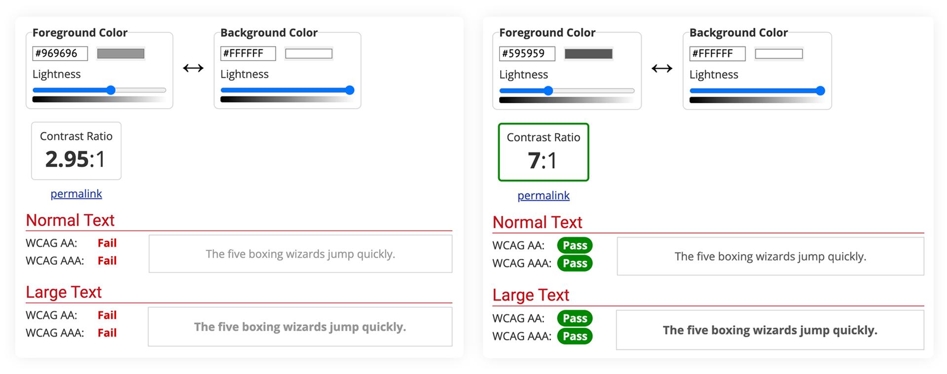
The foremost objective for any association website should be to ensure it is easy to use and accessible to all users, regardless of their devices, browsers, or abilities. Implement responsive design, clear navigation, and adhere to Web Content Accessibility Guidelines (WCAG) to accommodate diverse audiences. This could include, but is not limited to, ensuring high contrast levels for font colours (you can use this tool to check), creating semantically correct text content for screen readers and applying descriptive alternative tags for images.
|
The example on the left shows a font colour pairing that would fail WCAG standards. The example on the right shows a font colour pairing that would pass WCAG standards. |
As of January 1, 2021, the Ontario government stated that the AODA requires you to make all public websites accessible if you are either a designated public sector organization or a business or non-profit organization with 50 or more employees. This means ensuring your website meets WCAG 2.0 levels A/AA.
2. Showcase Your Brand Identity
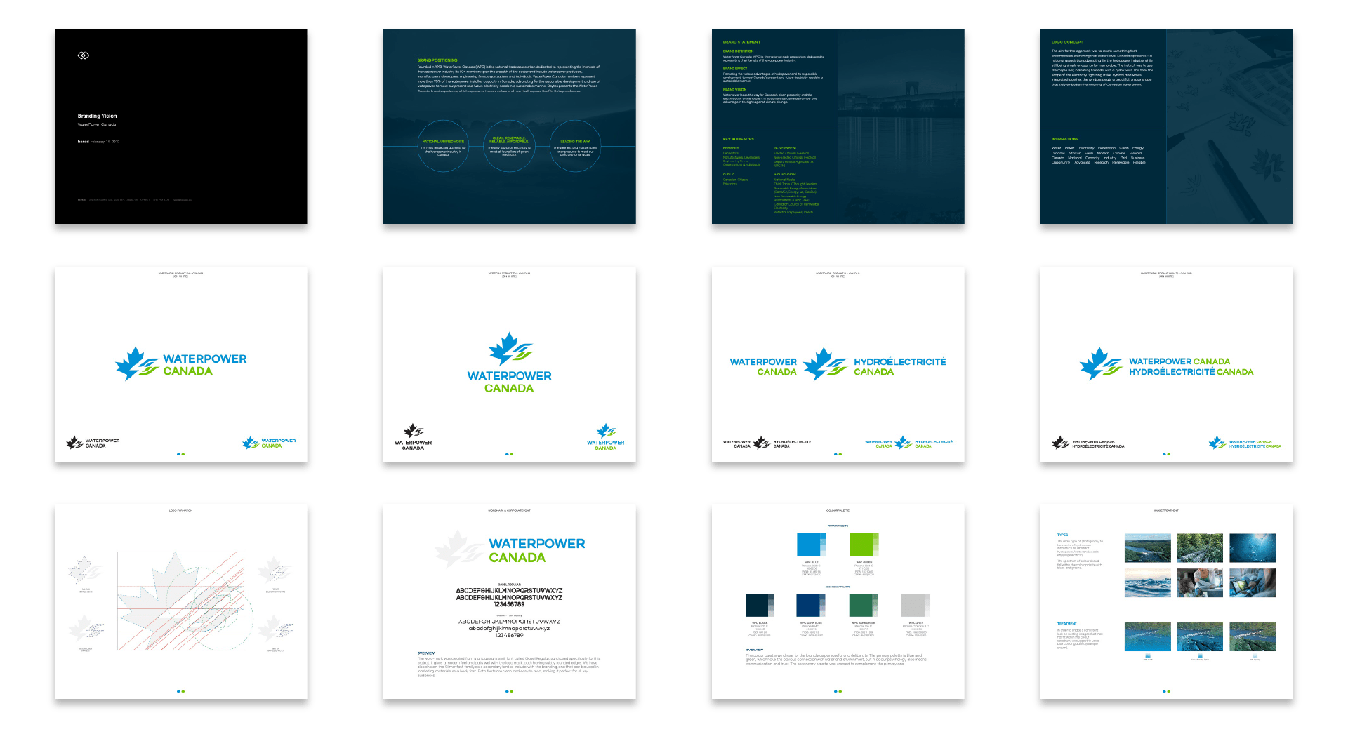
Your website is an extension of your association’s identity. It is likely the place many will come across your brand for the first time. Utilize consistent branding elements like logo, colour scheme, typography, tone of voice and imagery throughout the site to create a cohesive and memorable experience. This not only enhances your organization’s image but also instills trust and credibility among your members.
|
A brand’s elements can be applied across the website to ensure it is consistent with all other marketing touchpoints. This example is from our WaterPower Canada case study – you can visit the website to see how we applied the elements above to the website. |
3. Easy-to-Use Navigation
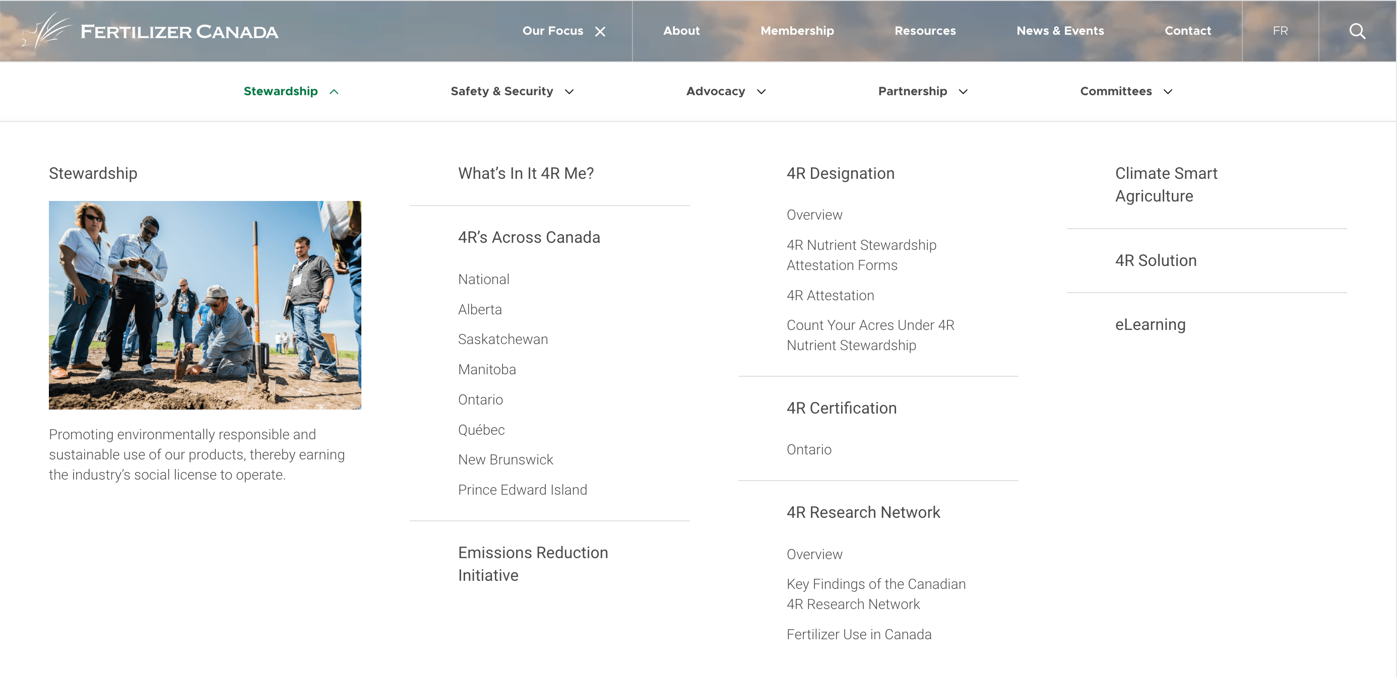
A well-structured and intuitive navigation system is essential for users to find information quickly and easily. That means taking the time to create a well-constructed website plan that takes into account the website’s goals and what the potential users will be looking for. Think about the priority of content, as this will ultimately determine the information architecture and navigation of the website.
|
This example above shows how we organized Fertilizer Canada’s navigation based on their areas of focus. |
Another suggestion is to use alternative means of navigating the website beyond the main menu. Examples of this is to utilize calls to action throughout the content or help a target audience identify themselves, and then provide links to information that would be of most importance to them.

|
This example shows the different audiences for the Federation of Law Societies of Canada’s NCA program – clicking on one of these items would then provide contextual quick links to pertinent areas of the website for that respective audience. |
4. Prioritize Member Experience
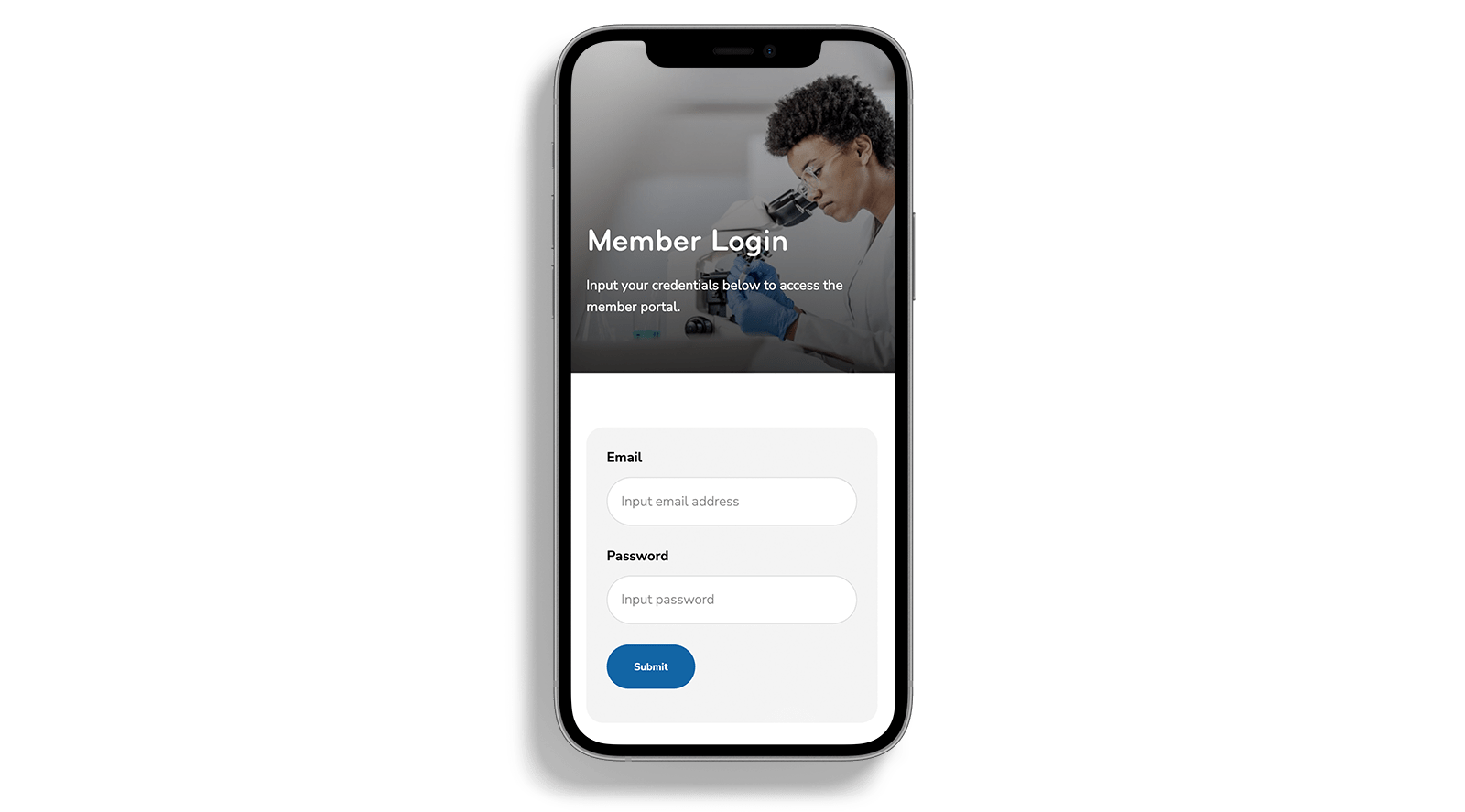
Members are the backbone of any national association. Ensure your website is designed with their needs in mind by providing exclusive access to resources, events, and networking opportunities. If a member portal is required, our recommendation is to have it on a separate platform, but provide a seamless login process from the website. By keeping the member portal separate, it means the public-facing website can be refreshed or even change CMS without even affecting the portal.
|
This example shows a login for Innovation Medicine Canada’s member portal. For more information on this project, check out our case study. |
5. Regularly Update Content
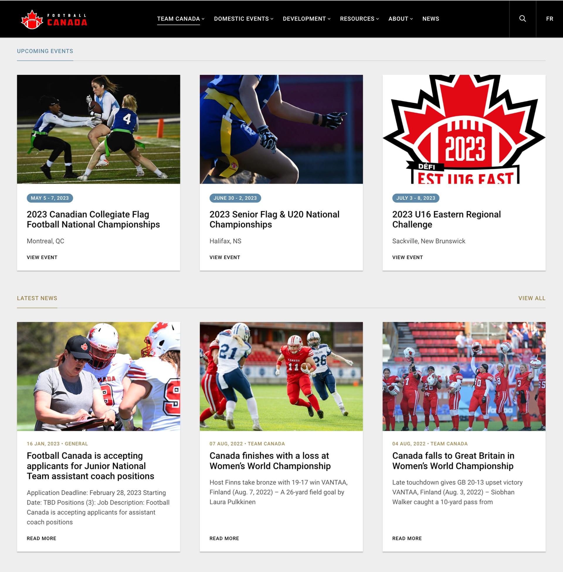
Keep your website content fresh and relevant by regularly updating news, articles, events, and resources. On the membership side, this not only keeps members engaged but also improves your website’s search engine ranking, making it easier for potential members and other stakeholders to find your association online. For public outreach, this also ensures the media is aware of your position on current issues and what research you are working on. By regularly adding and updating content, you will ensure repeated engagement with the website.
|
A blog, news or events section are easy to populate sections of the website. Use topics that your members or stakeholders would find appealing and useful. Football Canada’s website is a good example of this. |
6. Optimize for Each Device
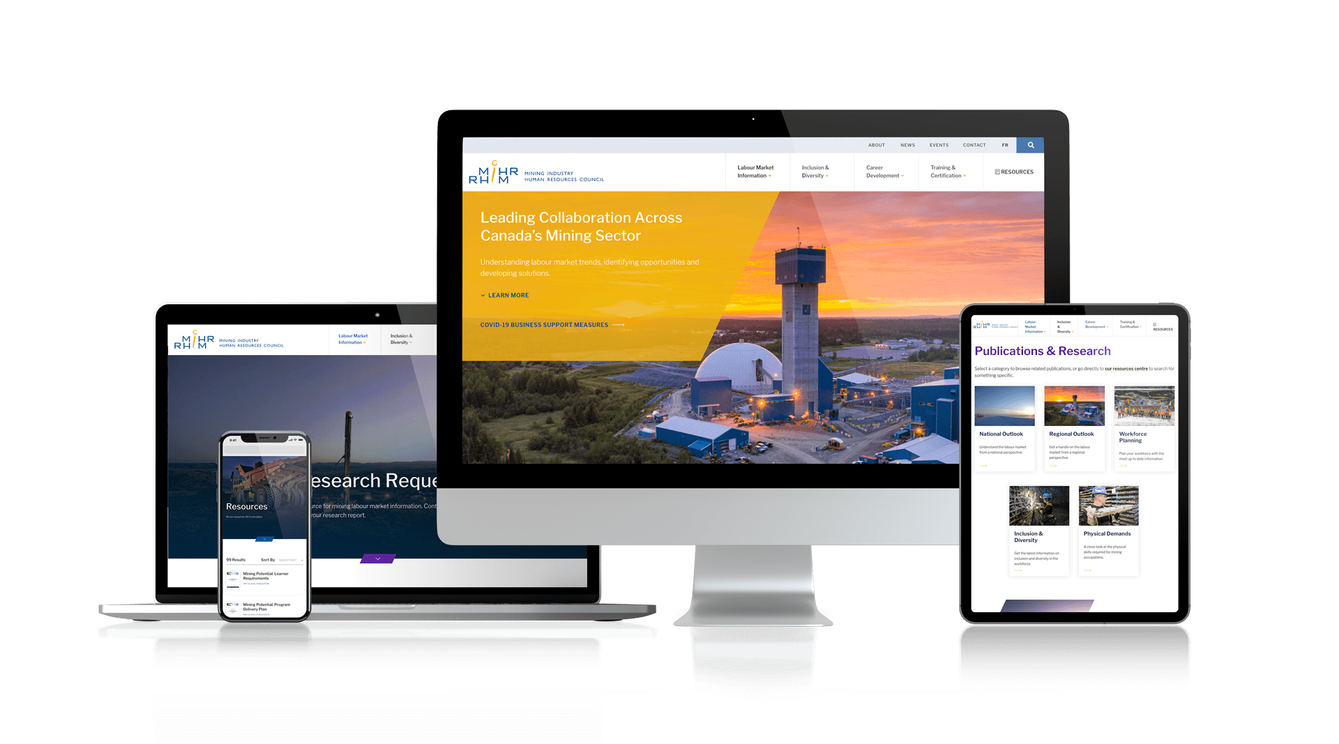
With more users accessing websites through mobile devices, it’s essential to ensure your website is optimized for smartphones and tablets. We suggest employing a responsive design that adapts to different screen sizes and has mobile-friendly navigation to provide a seamless browsing experience.
|
A responsive website design should work across all device resolutions, such as The Mining Industry Human Resources Council’s website in this example. |
7. Integrate a Resources Hub
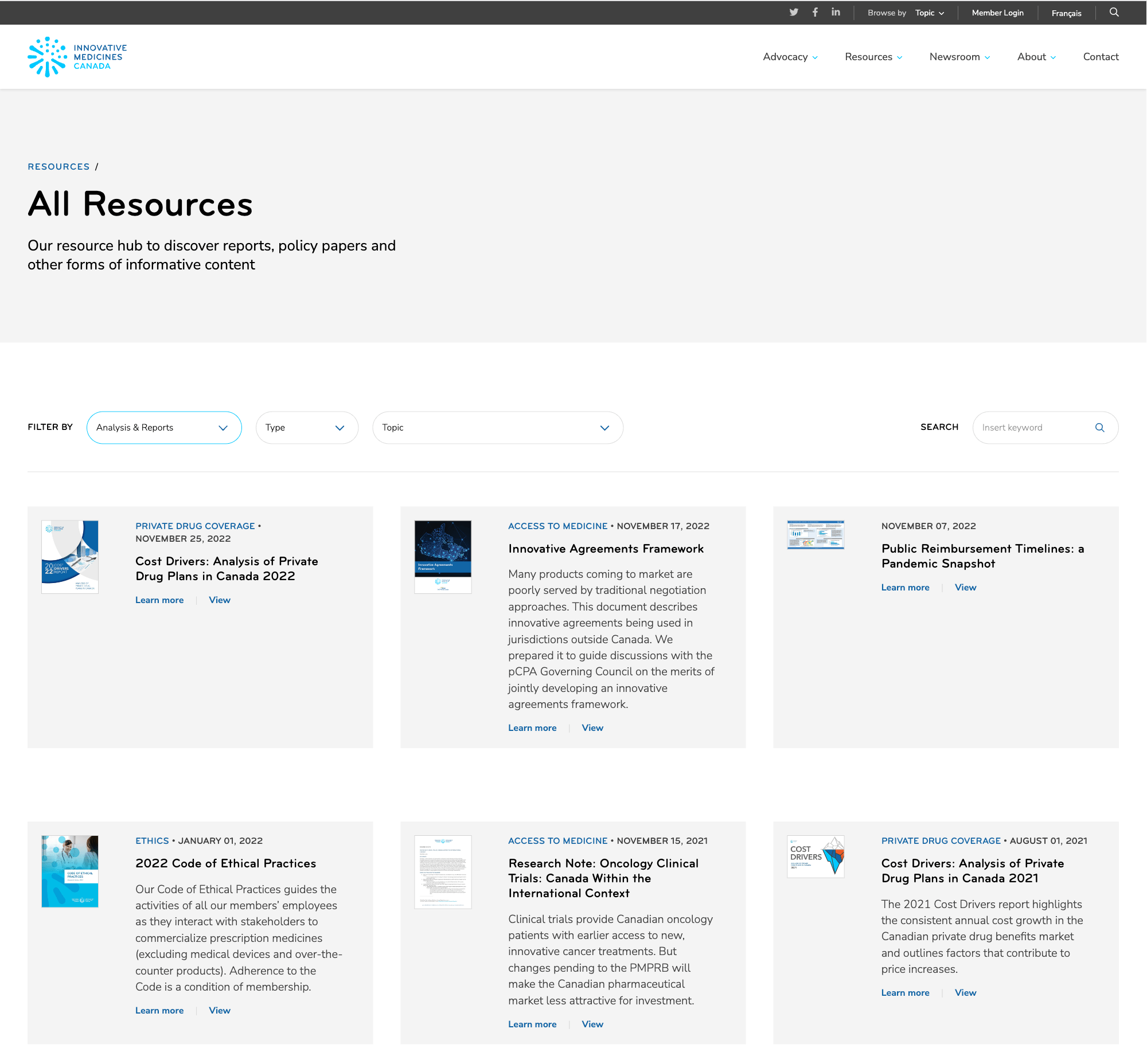
Often users of the website want to dive deeper into certain topics. Sometimes it doesn’t make sense to include certain levels of information directly in the website content, and that’s where a resources section can come in handy. These can house resource types such as white papers, presentations, case studies, documents, videos or external links. These can also then be easily shared on social media platforms.
|
IMC’s resource section is a good example of an easy-to-use archive of all resources available on the website. |
The resource section should provide tools for the users to easily find the topics they want to find out more about, such as filters and sort-by dropdowns. It is also possible to create gated content within the resources section – this means encouraging users to sign up in order to gain access to certain resources.
8. Encourage Calls-to-Action
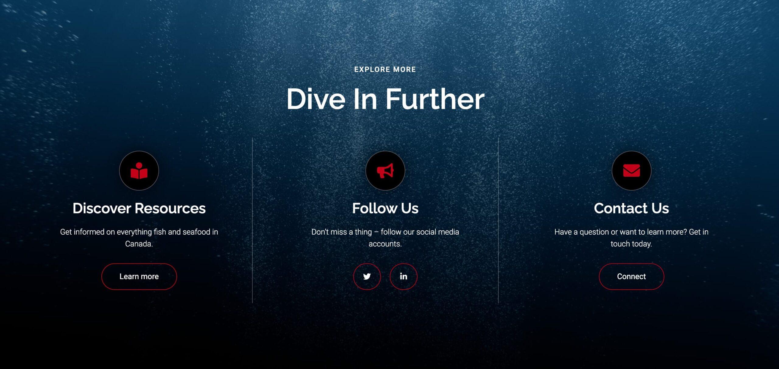
Clearly defined calls-to-action (CTAs) guide users towards specific actions, such as joining the association, registering for events, or signing up for newsletters. These actions will be determined by the goals you have for the website, and that is something that should be developed in the website planning stages. We always encourage the use of prominent and enticing CTAs throughout your website to boost member acquisition and public engagement.
|
The Fisheries Council of Canada website utilizes something we call a “Final CTA” – this means the user has got to the bottom of the website, and we want to prompt them to take action. By providing various CTAs once they’ve engaged with the content ensures the potential for further engagement. |
9. Utilize Compelling Visuals
High-quality visuals, such as images, videos, and infographics, can enhance your website’s appeal and effectively convey your association’s message. We insist on using visual elements strategically to break up text-heavy pages, illustrate key points, and create a visually appealing and dynamic user experience. We encourage this practice especially on homepages and main pillar pages of the website. Once we get to the third or fourth level of the website, we can rely on more in depth text content as the user is likely to be interested in the subject given they have come so far.

|
We developed this infographic for the homepage of the Fairtrade Canada website. Its visual appeal means users are more likely to read the statistics and delve into the website further. |
10. Measure and Analyze Performance
Regularly track and analyze your website’s performance to identify areas for improvement. Use tools like Google Analytics to gather insights on user behavior, traffic sources, and popular content. By monitoring and adjusting your website based on data-driven insights, you can continuously optimize the user experience and better serve your members. If you don’t have the time to track these sorts of metrics, you can always employ an agency to do it on your behalf.

|
In order to make future decisions about your website, it is important to have real data to weigh the potential impact they may have. Check out our article on website design and user behaviour for more information on this topic. |
Conclusion
A well-designed and user-friendly website is vital for national associations to effectively serve their members, reach stakeholders and ultimately achieve their goals. By following these 10 web design best practices, you can create a powerful online presence that not only fosters member engagement, but promotes your association’s mission. Remember, a successful website is one that evolves with your organization and its members – always be open to refining your approach and embracing new opportunities for growth.
Did you find this article helpful?
Stay updated on the latest industry insights, how-to guides, and expert opinions by following our LinkedIn page. Don’t miss out on valuable content to help you stay ahead in your field.


