Who: The National Airlines Council of Canada (NACC) is an association intended for all air carriers facing similar regulatory and policy issues. All passenger air carriers are eligible for NACC membership, provided that they hold the certifications and licenses required in our by-laws.
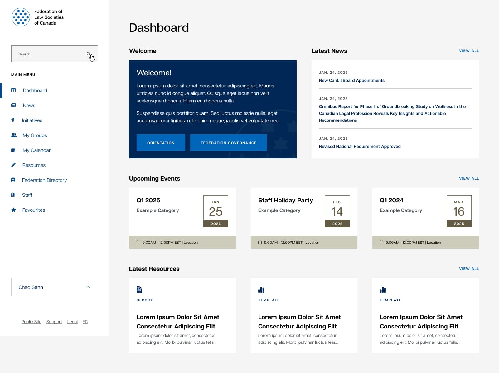
How: Baytek did a complete rebrand of their identity, print materials and bilingual website. The result was a clean, fresh new brand which clearly stated their status as the voice of Canada’s largest airlines. The logo mark for the NACC was created to represent a number of ideas – being a Canadian association, an association advocating for the airline industry, and connecting people across the globe. The Canadian part of the mark is represented by the maple leaf, which is a very common symbol associated with Canada. The airline part is symbolized through the darker part of the logo, and also the negative space in the leaf, creating a plane-like structure. The final part is the line in the leaf, representing connections, a path, a horizon line and a journey.
“It was our first foray into such a project and it quickly became apparent that we were in good hands. Sebastien, Jim and team provided us with the practical guidance we needed and then let their creative juices go to work. I was particularly impressed with their ability to meet our launch deadline as we headed on the home stretch. The result is a user-friendly, visually appealing and fantastic website.”
Marc-André O’Rourke
Executive Director, National Airlines Council of Canada


