Designing a brand and experience that reflects connection and journey
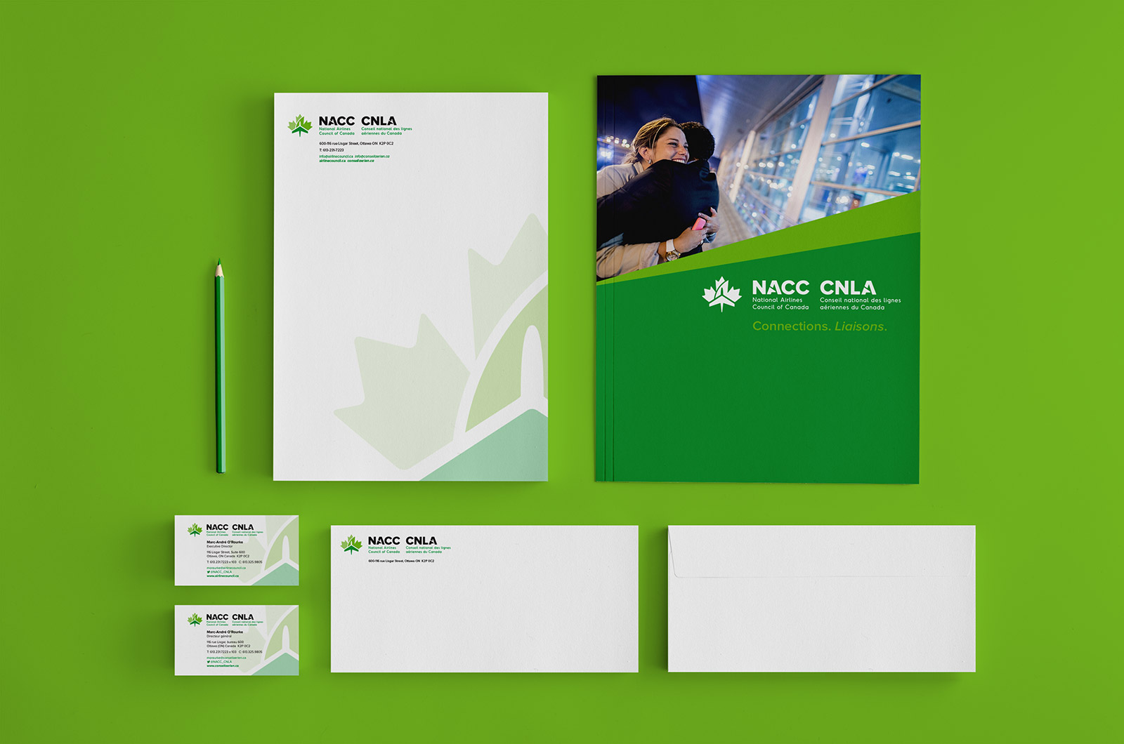
The NACC is the National Airlines Council of Canada, advocating for safe, environmentally responsible and competitive air travel. Baytek did a complete rebrand of their identity, print materials and bilingual website. The result was a clean, fresh new brand which clearly stated their status as the voice of Canada’s largest airlines.
Sector
Specialties
What we did

Making connections
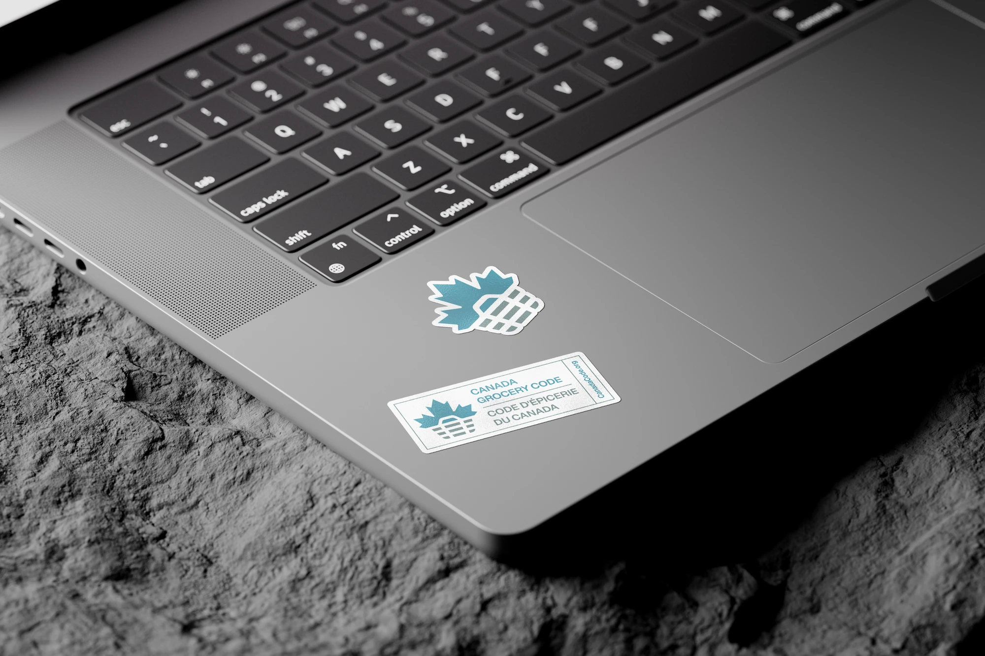
The logo mark for the NACC was created to represent a number of ideas – being a Canadian association, an association advocating for the airline industry, and connecting people across the globe. The Canadian part of the mark is represented by the maple leaf, which is a very common symbol associated with Canada. The airline part is symbolized through the darker part of the logo, and also the negative space in the leaf, creating a plane-like structure. The final part is the line in the leaf, representing connections, a path, a horizon line and a journey.
From dawn to dusk
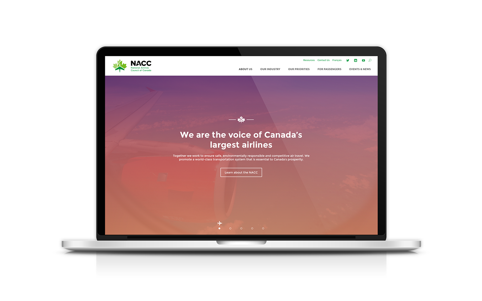
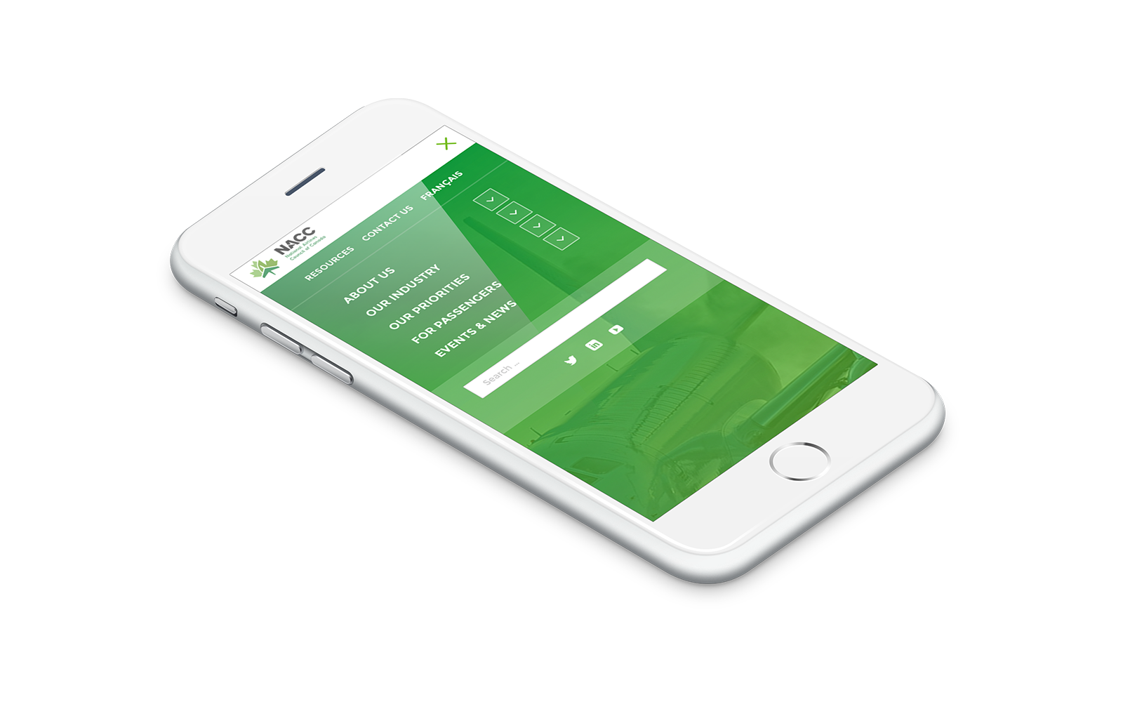
As the airline industry is 24/7, we had the idea of creating a home-page that reflected this dawn to dusk nature of the business. Using gradients, imagery and call-to-actions, the user gets a unique experience as they scroll through the first page. The remaining pages are interactive utilizing vivid imagery and call-out text.
More Design Case Studies

Connect
Ready to explore your next design project?
Every project starts the same way: with conversation. Lets take time to understand your challenges, your organization, and what success really looks like. Just honest dialogue about whether we’re the right fit.
Prefer email? hello@baytek.ca
Or call us at 613.759.4423