The importance of a strong logo in brand identity cannot be overstated. A powerful logo can spur growth, build a community, or even start a movement. However, not every organization gets it right the first time. Some refine their logos over time until they reach the purest form – some even get there, move away, and then come back.
The four key principles of a successful logo are relevancy (to the organization’s work or industry), originality (when compared to the competition), memorability (for the target audience), and simplicity (for any application, big or small). We’ll discuss these principles in further detail in a future article, but for now, we’ll use them as reference points to understand why organizations seek to refine their logo over time.
We’ll examine the logos of four brands: Apple, Amazon, IBM, and Adobe. While all technology companies, they each followed a different path on their way to the latest iteration of their logo. Let’s dive in.
Apple

Evolution: The journey from Newton to the minimalist monochrome
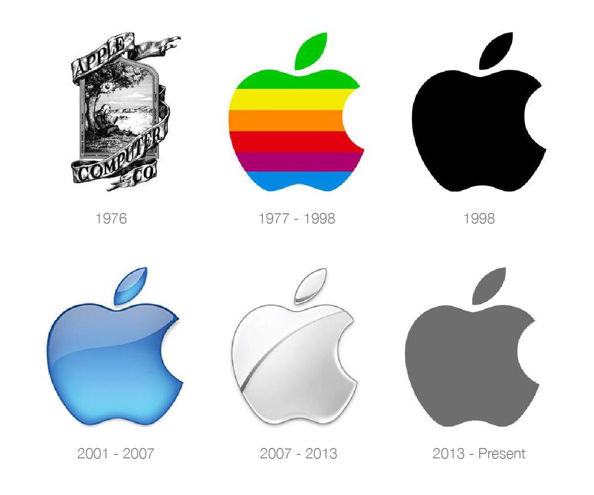
The original Apple logo, designed by Ronald Wayne, depicted the moment just before the apple fell on Isaac Newton’s head. While it certainly had a sense of humour, its potential pitfalls for use were immediately evident. Although original and memorable, it was far too intricate and complicated for many applications, especially for appearing on computer devices.
It’s no surprise that the logo lasted only a year before being replaced by the Rob Janoff-designed bitten apple mark. The rainbow colour scheme was a nod to the Apple II computer – the world’s first colour display computer. Not long after Steve Jobs’ return to the company in 1997, the rainbow was replaced with black. The two subsequent logos reflected the physical qualities of Apple’s products (the translucent, colourful iMacs, and then the aluminum-based products). In 2013, the company returned to the simple design we know today – a flat, recognizable shape without gimmicks or trendy elements.
Key lessons
- Don’t be afraid of change: even though the original logo was only a year old, Steve Jobs had the foresight and courage to make a change.
- Simple is timeless, while trends come and go: the most successful logos are those that defy being tied to a specific era.
- Look to the past: sometimes the answer has already been discovered – observe the similarities between the 1998 logo and the present one.
Amazon

Evolution: From a simple online bookstore to the global smile
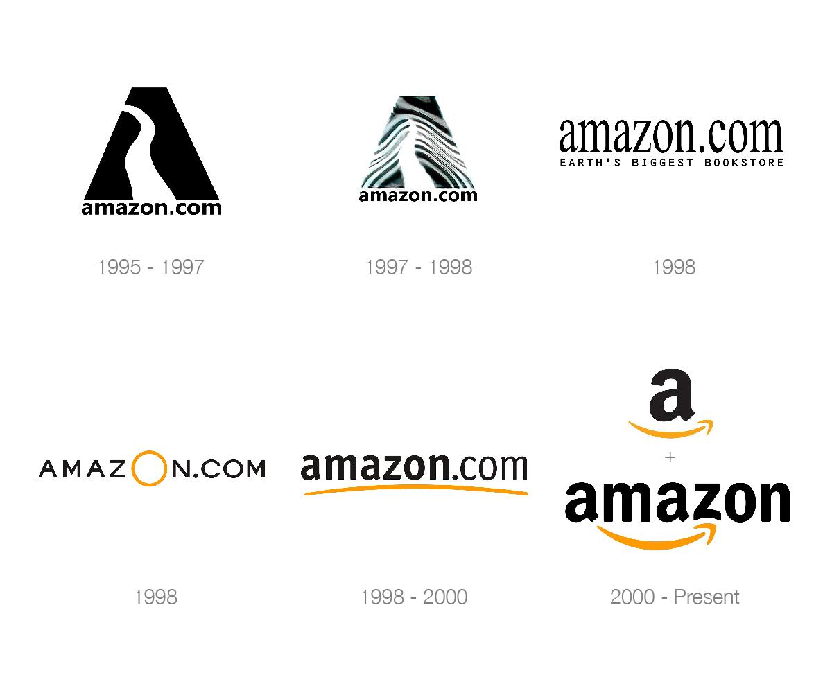
When Amazon first launched, it was an online bookstore with a simple, unassuming logo featuring a large stylized “A” with a river flowing within it. While it was original and relevant to its name, it didn’t fully capture the essence of the brand’s ambitions.
In the years 1998 to 2000, the logo evolved to include the now-famous smile, which doubles as an arrow pointing from the “A” to the “Z” in the company’s name. This clever design communicates that Amazon offers everything from A to Z while maintaining a customer-centric focus. The transition from a bookstore to a global online marketplace required a logo that was both memorable and adaptable.
Key lessons
- Adapt to growth: as your company expands, your logo should evolve to encompass your brand’s larger vision.
- Embed your message: a well-designed logo can convey your brand’s values and promises in a subtle yet powerful way.
- Keep it simple: a versatile logo that works across various platforms and applications is essential in today’s digital world.
IBM

Evolution: The stripes of success and the power of consistency
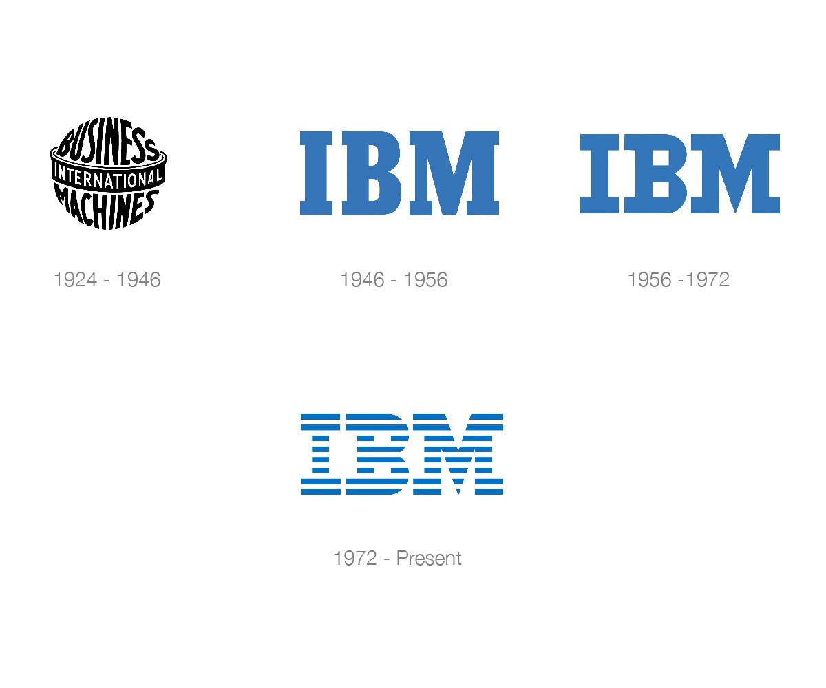
IBM’s early logos were intricate and complex, featuring various elements such as globes and detailed lettering. In 1956, designer Paul Rand introduced a simple, block-letter logo that laid the foundation for the brand’s identity. However, it wasn’t until 1972 that Rand developed the iconic striped logo we know today.
The horizontal stripes represent speed, dynamism, and progress, while the consistent use of blue signifies trustworthiness and stability. Despite the changes, IBM maintained its core brand identity, exemplifying the power of consistency in logo design.
Key lessons:
- Remain consistent: even as your logo evolves, maintaining a consistent brand identity is crucial for recognition and trust.
- Embrace simplicity: a simplified logo often conveys your brand message more effectively and ensures adaptability across various platforms.
- If it’s not broken, don’t fix the logo: IBM’s current logo, now over 50 years old, exemplifies enduring quality. When a logo works well, focus on refreshing or expanding other brand elements instead.
Adobe

Evolution: Transitioning from a word-mark to an icon
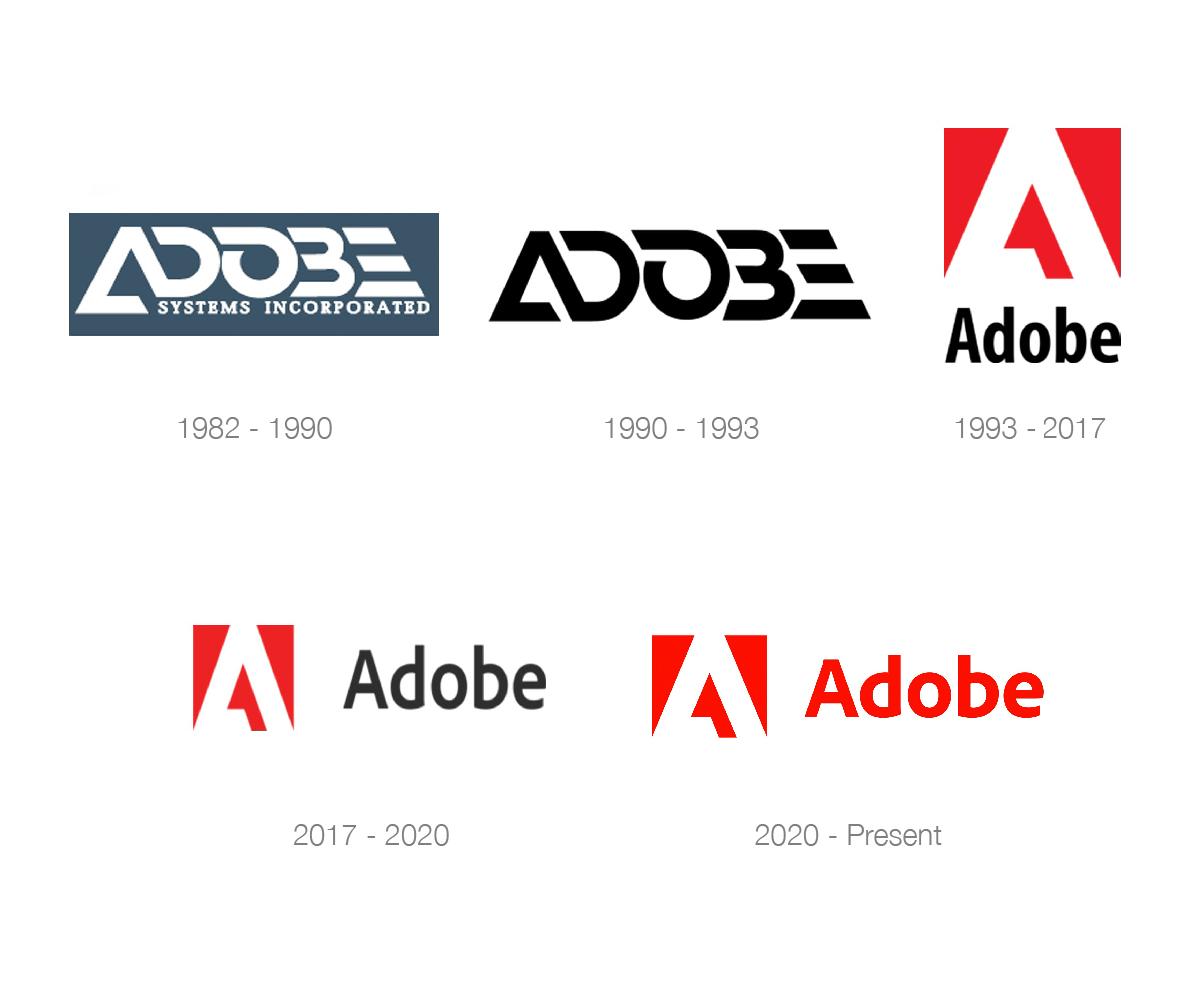
Adobe’s original logo featured a word-mark in a distinctive, tech-inspired custom font. While unique and recognizable, it lacked the simplicity and adaptability needed for broader applications. In 1990, they removed “Systems Incorporated” from the word-mark but still needed a standalone logo mark—an icon that could be used independently of the name.
In 1993, Adobe introduced the familiar red “A” icon, created by superimposing the “A” from the original word-mark onto a red square. This design was further streamlined in 2018, resulting in a sleek, modern form that is easily identifiable and scalable across platforms. In 2020, a bolder version of the font emerged, with the “A” returning to a squarer, more symmetrical shape.
This progression towards a minimalist “A” showcases Adobe’s dedication to the digital age while preserving the core elements of its brand heritage.
Key lessons:
- Adapt to industry changes: as technology and customer needs evolve, your logo should reflect those shifts to stay relevant.
- Find a balance: preserve the essence of your brand while simplifying the design to ensure a timeless and adaptable logo.
- Maintain brand recognition: even when updating your logo, consider elements like colour that will maintain familiarity with your existing audience.
Conclusion
In this article, we’ve explored the logo evolution of four iconic technology brands: Apple, Amazon, IBM, and Adobe. The transformations of these logos reveal valuable lessons in the importance of adaptability, simplicity, and consistency when it comes to logo design. As your organization grows and evolves, don’t be afraid to refine and optimize your logo to reflect your brand’s current vision and identity. By learning from these successful brands, you can pave the way for your company’s future success.
Did you find this article helpful?
Stay updated on the latest industry insights, how-to guides, and expert opinions by following our LinkedIn page. Don’t miss out on valuable content to help you stay ahead in your field.
Click here to follow us on LinkedIn now!


