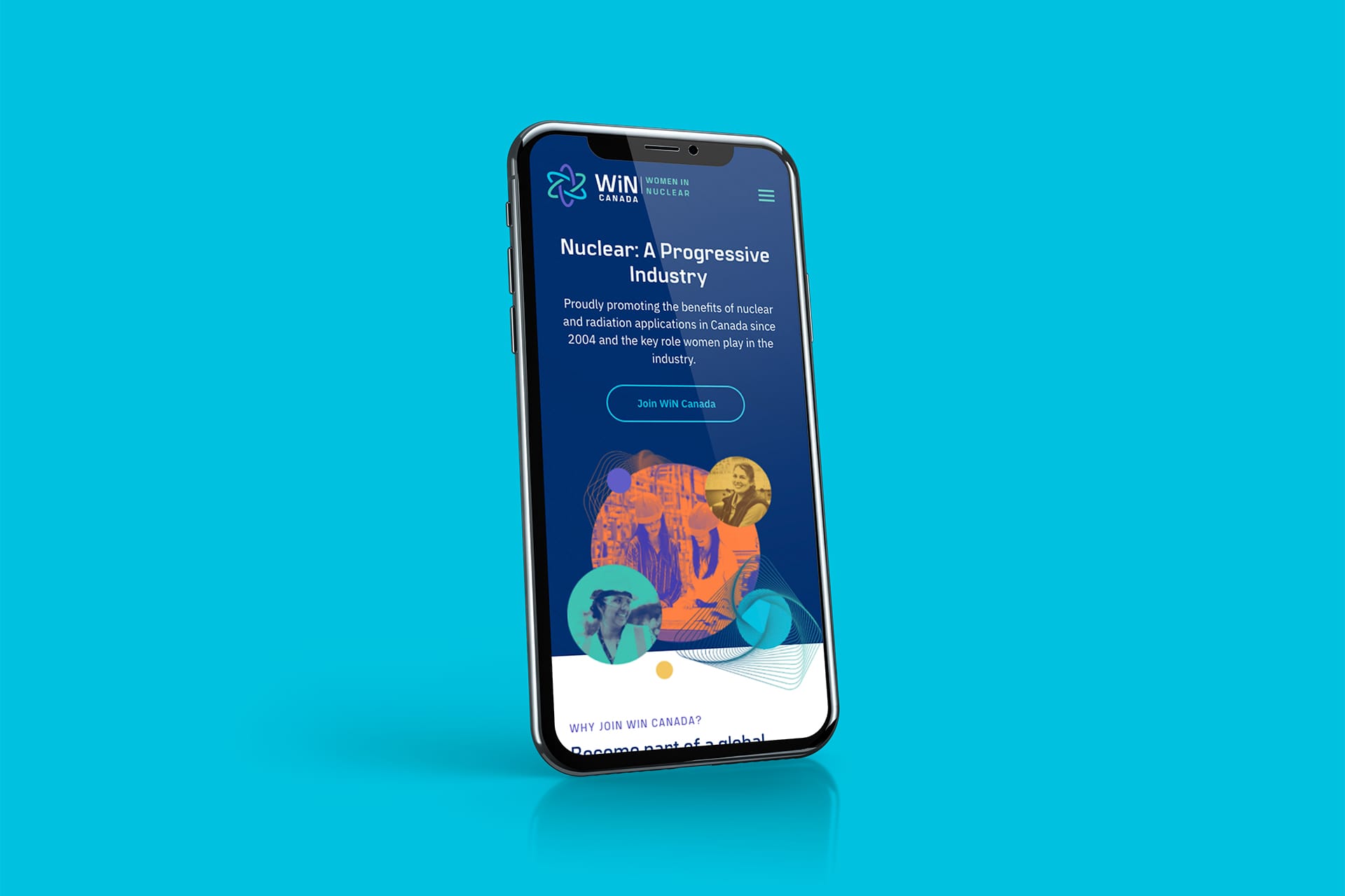
An atomic idea
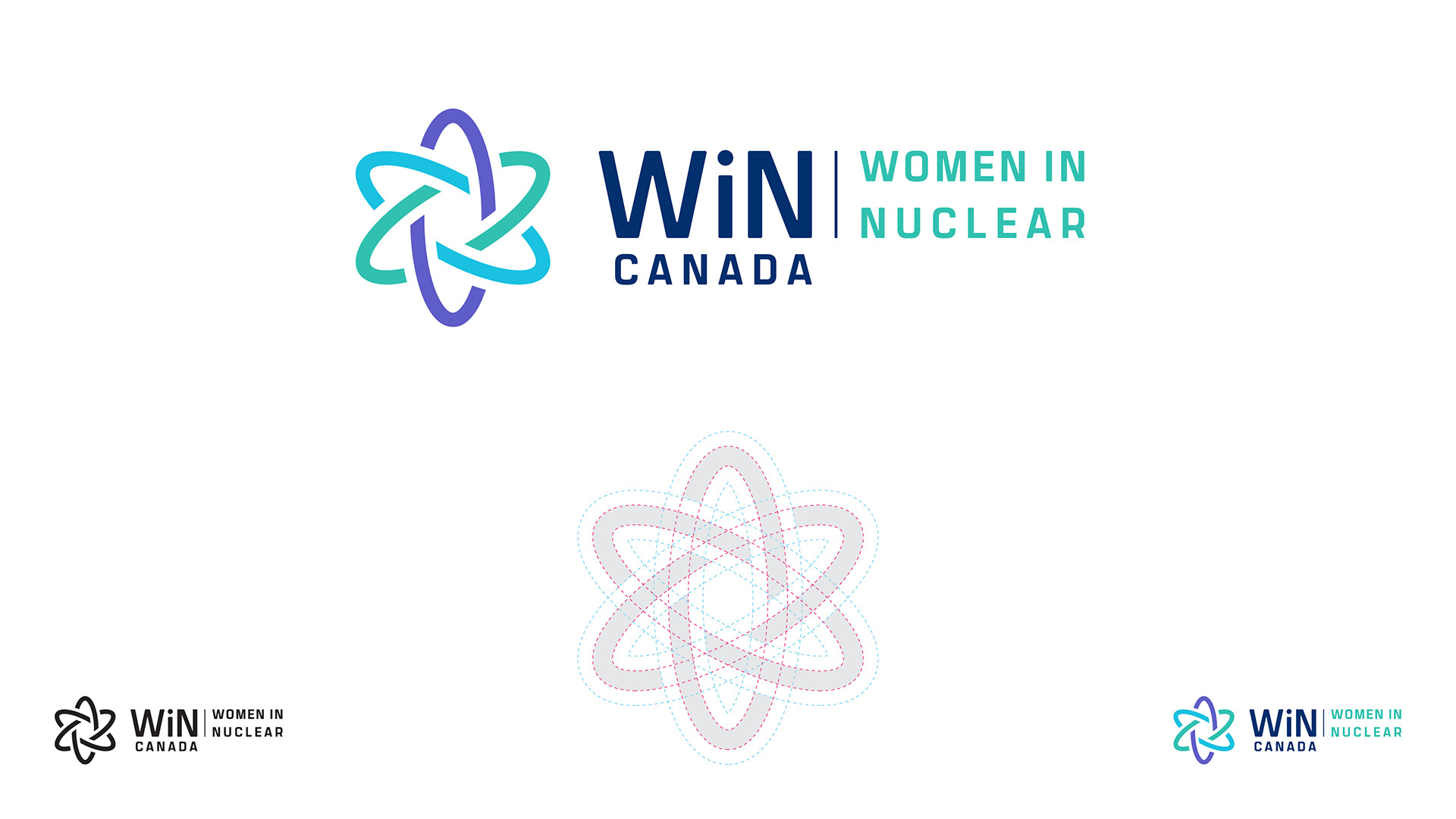
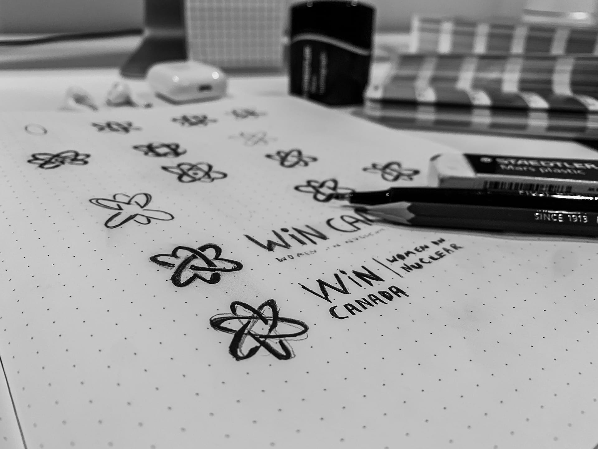
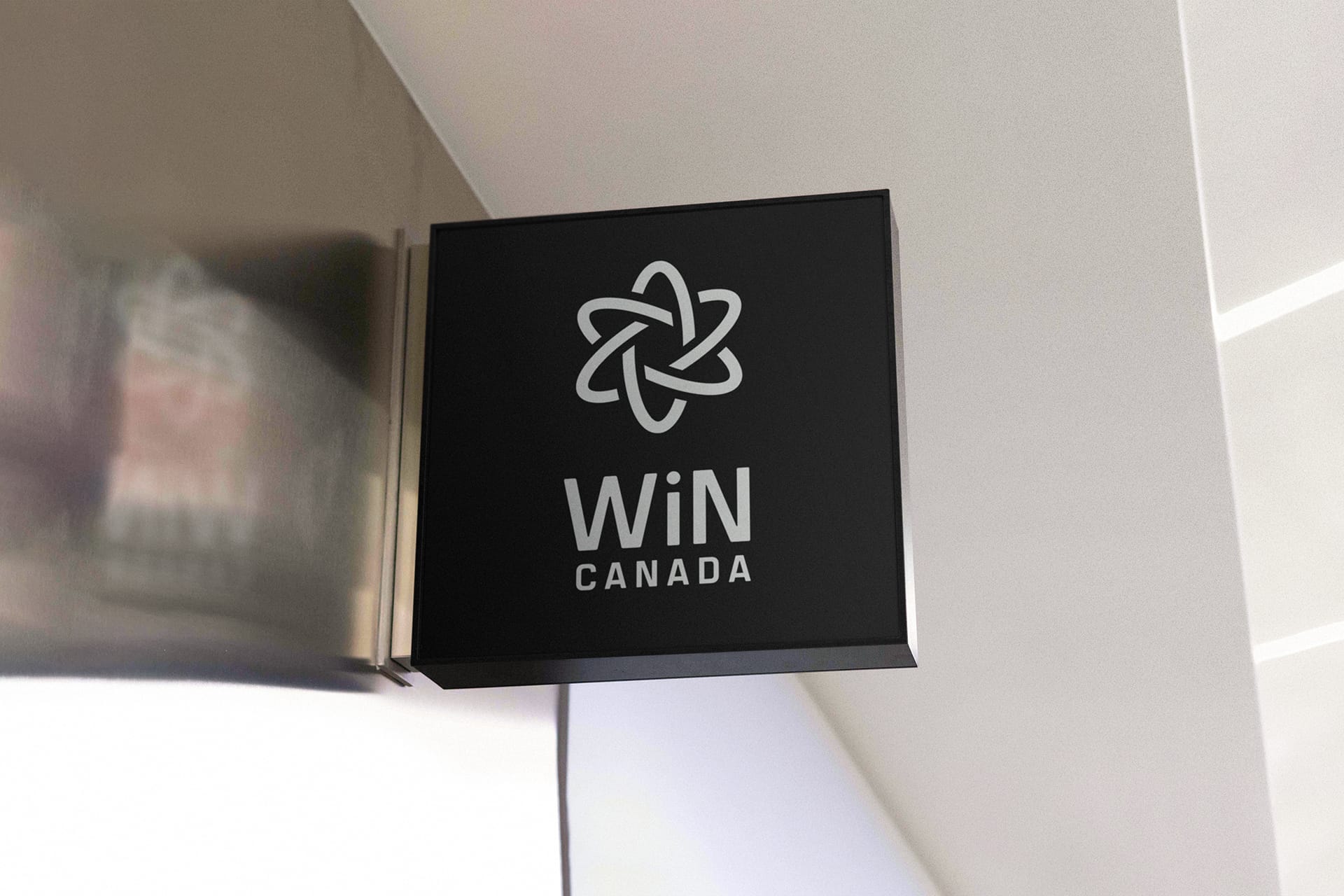
As part of a global organization (Women In Nuclear International), WiN Canada had some broad guidelines to follow in terms of their brand. We took these guidelines as a challenge to create something beautiful and unique, yet grounded in its simplicity. The result was an abstract atom symbol, with striking colours matching the boldness of the organization’s spirit. We paired the logo mark with a forward thinking sans serif font, striking a balance of readability and personality.


A new clear experience
The approach to refreshing WiN Canada’s web presence was to basically start from ground zero. During the web planning session we identified the target users and what they would need the website to do for them. From this we built an information architecture from the user task priorities, and then created a content structure that would ease them through the website. We designed the website using this structure, leaving us with a beautiful and dynamic website that truly shows off the new brand.

