M is for Milieu
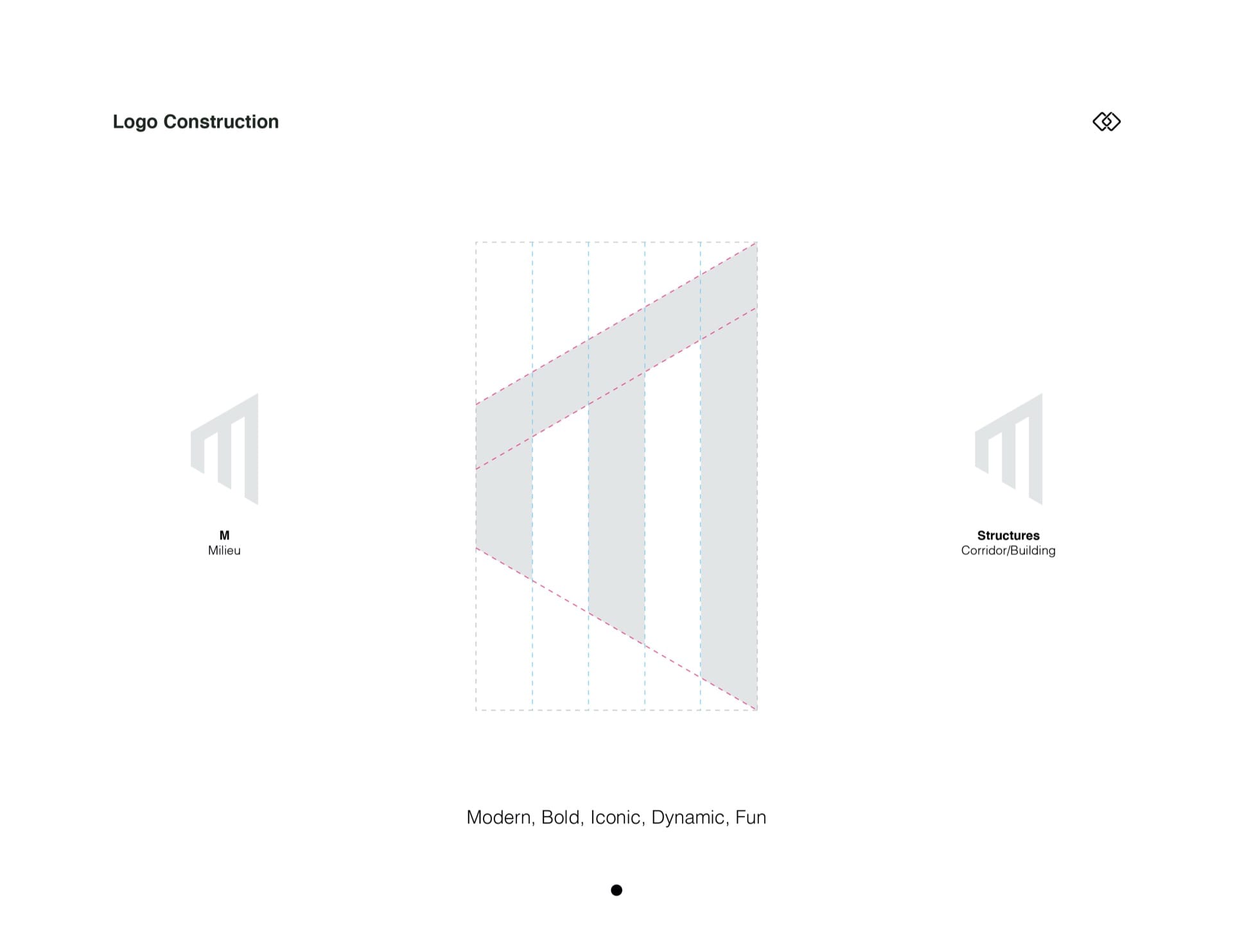
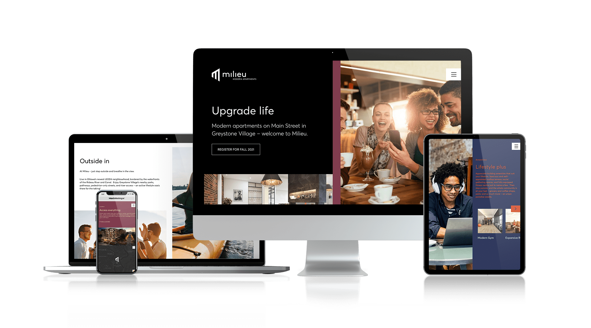
For the Milieu logo, we wanted to create something that was bold and iconic – something that would draw intrigue and curiosity. Taking inspiration from the building and the idea of structure, we transformed the brand initial (M) into a perspective that feels dynamic, energetic and fun. We contrasted the playfulness of the logo mark with a concise and clear word mark.


