Modernizing a brand to match the scale of its operations
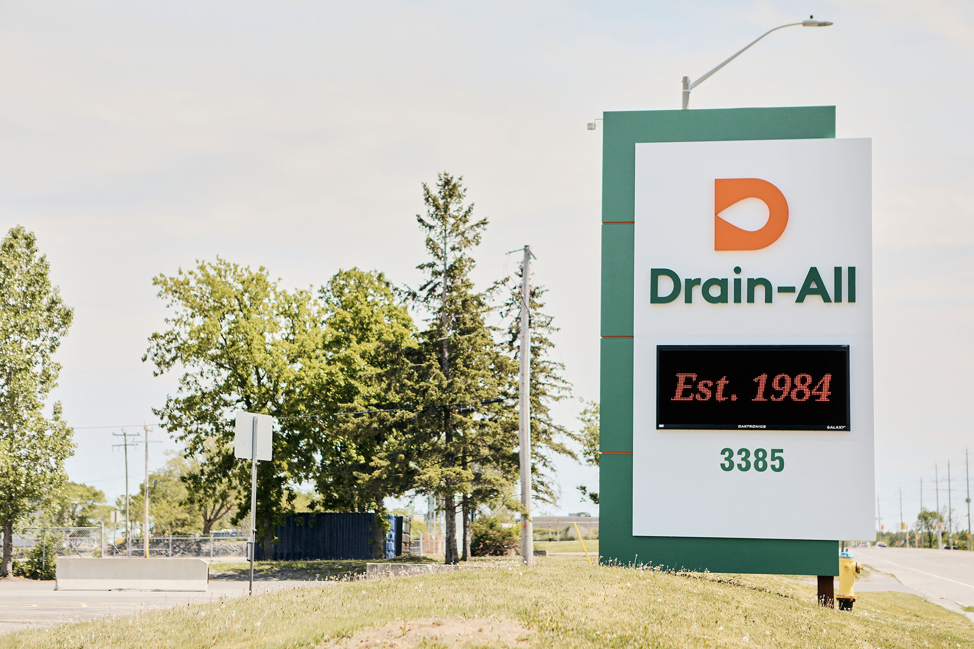
Established in 1984, Drain-All has expanded steadily since its origins and currently employs more than 200 team members at their offices and operating facilities in Ottawa and Napanee. Drain-All reached out to Baytek for a full rebrand and expanded web presence.
Sector
Specialties
What we did
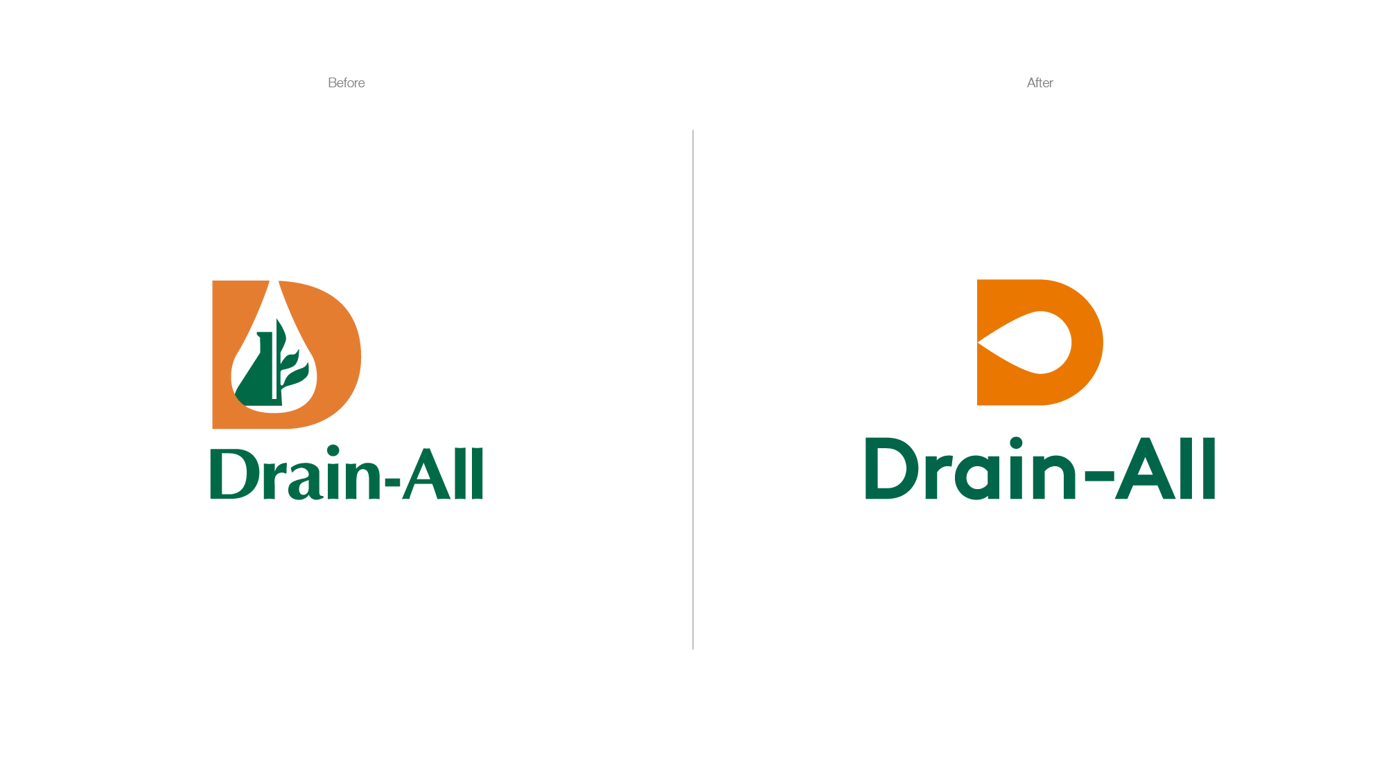
Where’s the drop?
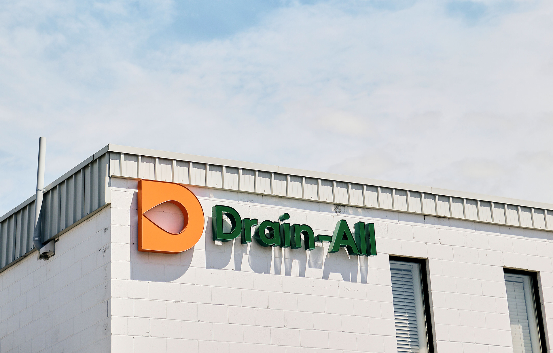
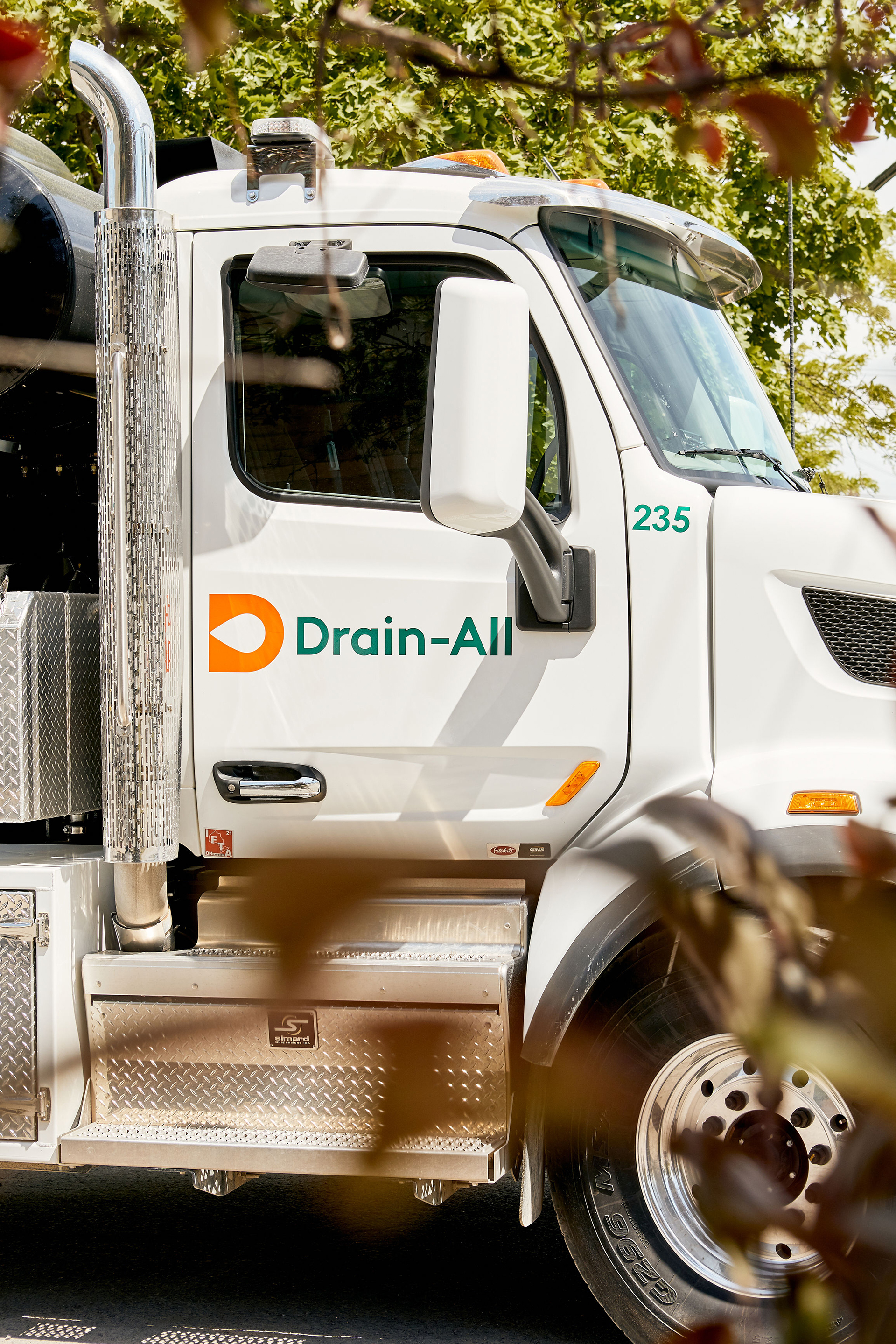
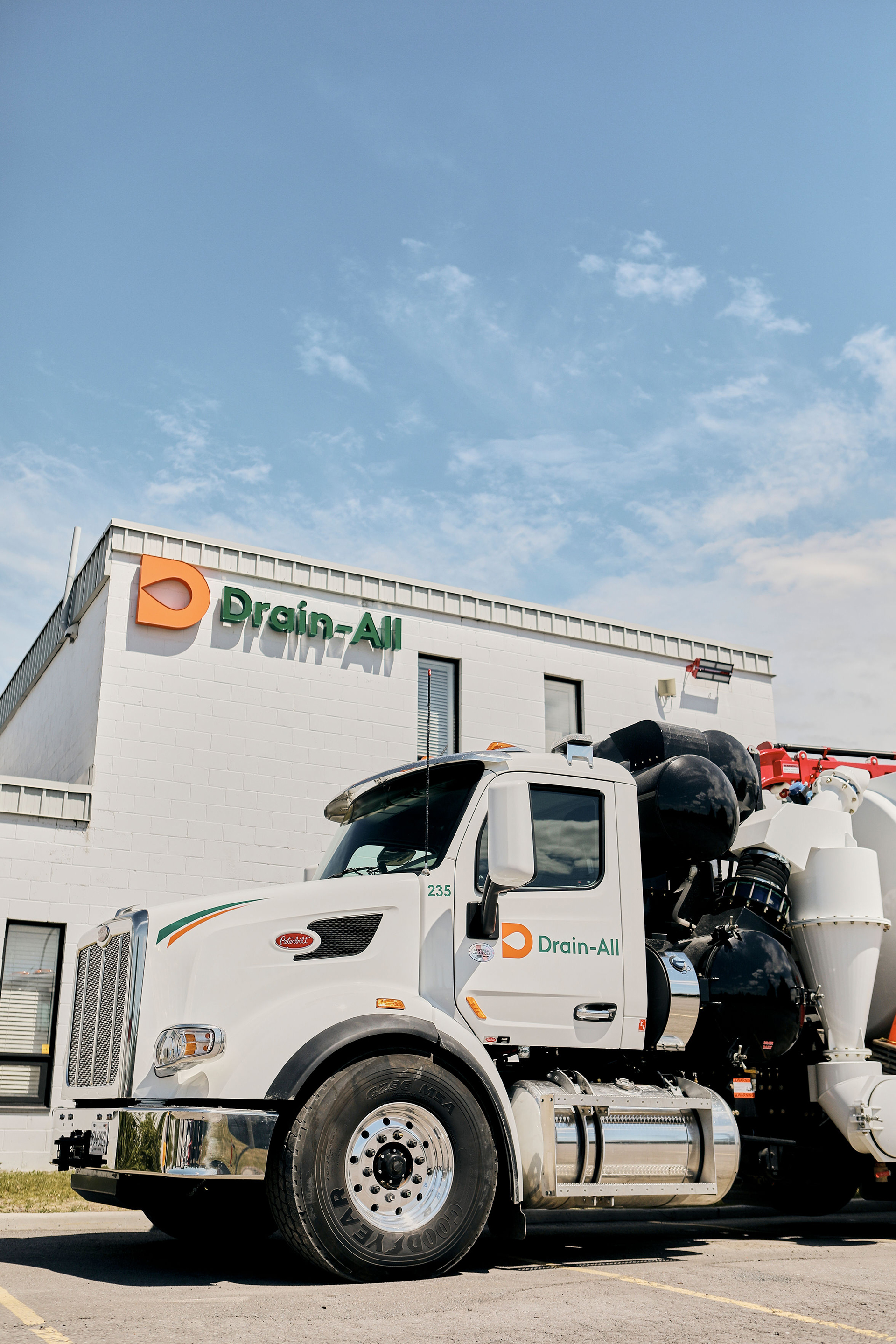
As you can see from the side by side comparison with the original logo (further down the case study), we had a straightforward blueprint for success – keep it simple… yet memorable. We removed the complicated ideas that were previously there, and focused simply on the water drop. By making it horizontal (implying spraying water) we kept a beautiful symmetry.
We modernized the colour palette, while still keeping the brand equity built up by the use of the green and orange.

Flushing out any old ideas
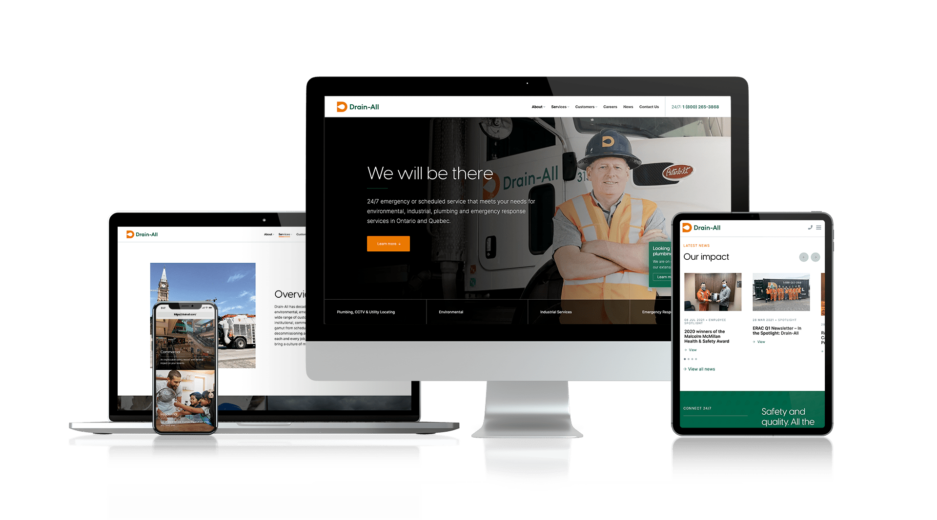
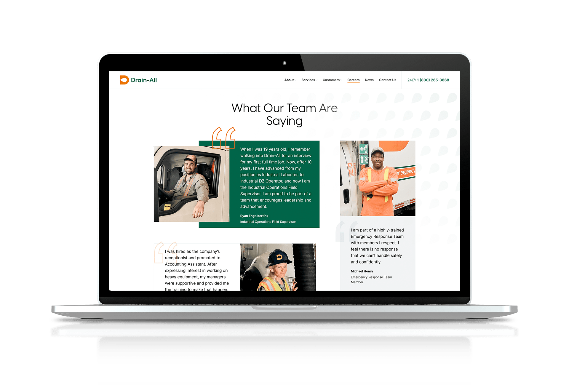
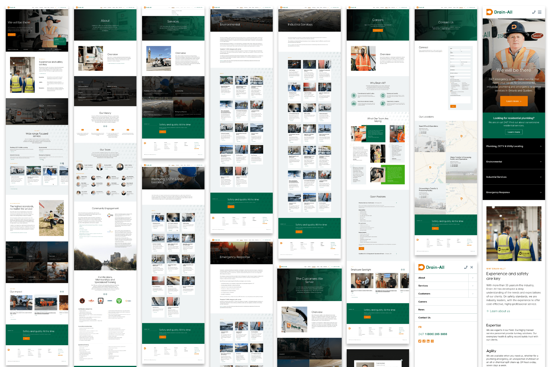
The approach to refreshing Drain-All’s web presence was to create a beautiful and engaging website that focused on their ever-expanding industrial clientele. It needed to reflect the size of the company – the sheer enormity of their fleet, and their immense capabilities. The result is a dynamic website that finally puts Drain-All firmly centre-stage.
Rebranding projects are time intensive and demand an understanding of who you are as a company and your messaging. Our friends at Baytek did an amazing job modernizing the Drain-All brand, from logo to website to marketing. I highly recommend this team.
Richard Roth
Chief Executive Officer
More Design Case Studies

Connect
Ready to explore your next design project?
Every project starts the same way: with conversation. Lets take time to understand your challenges, your organization, and what success really looks like. Just honest dialogue about whether we’re the right fit.
Prefer email? hello@baytek.ca
Or call us at 613.759.4423