What we did
- Branding
- UX
- Web Design
- Web Development
- Wordpress CMS

Only the best
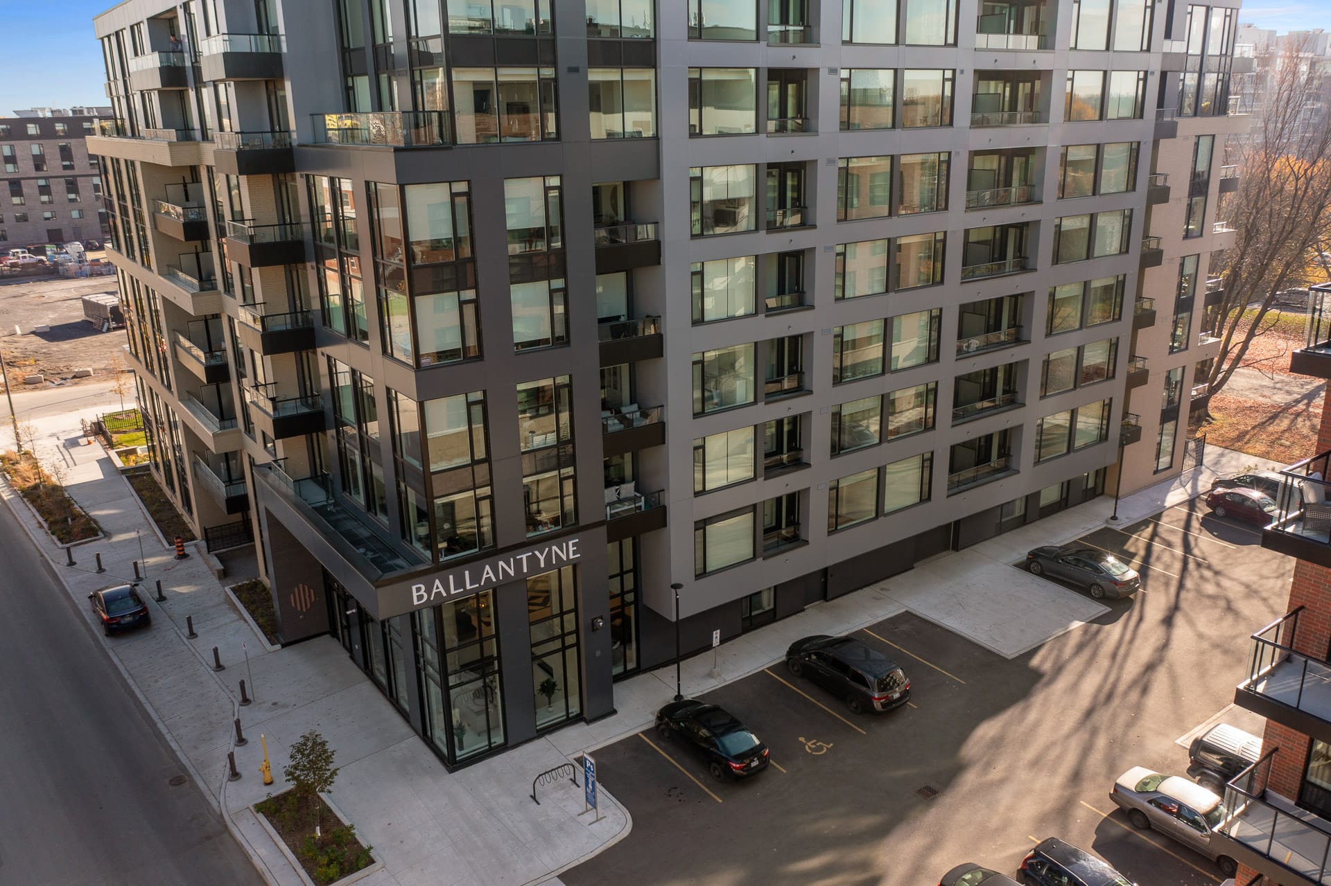
For the logo mark, we wanted to created an abstract design that had elegance and structure. We wanted to use the ‘B’ as the element to bring focus to Ballantyne, and make that the feature while building the other ideas around it. The result is a beautiful mark that will work across many applications. In order to bring an element of nature into the design, we used an earth tone, while contrasting it against an almost black to ensure none of the sophistication of the brand is lost.


Images courtesy of Regional Group
