Designing clarity for a new national standard
Baytek helped a brand-new, high-visibility regulatory organization establish credibility, clarity, and operational capability – under public scrutiny, tight timelines, and evolving requirements.
Sector
Specialties

The Situation
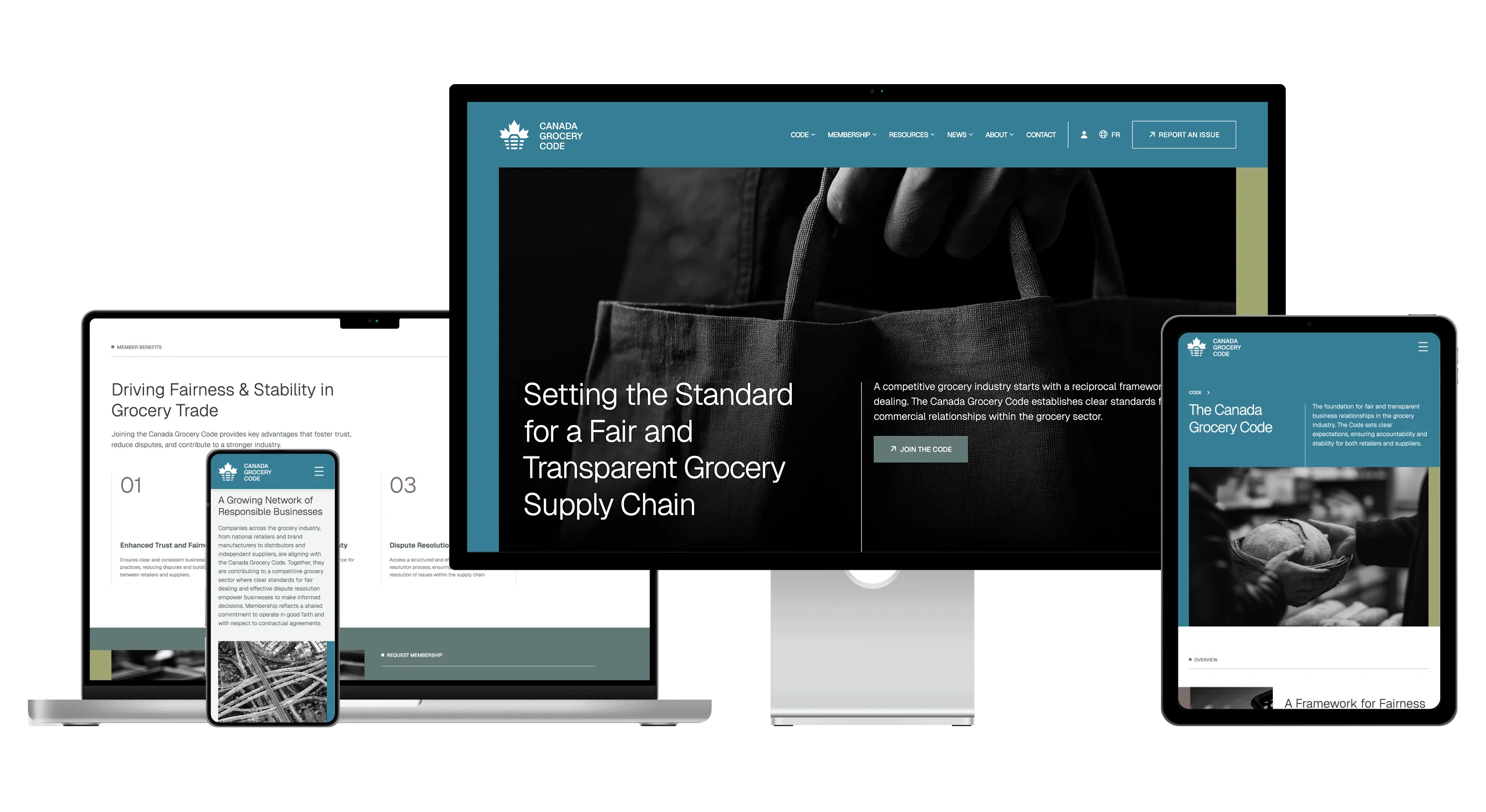
The Canada Grocery Code was established to support fairness, transparency, and accountability across Canada’s grocery supply chain. As a newly formed organization, it needed to quickly establish credibility with a wide range of stakeholders – including major retailers, suppliers, industry associations, media, and government.
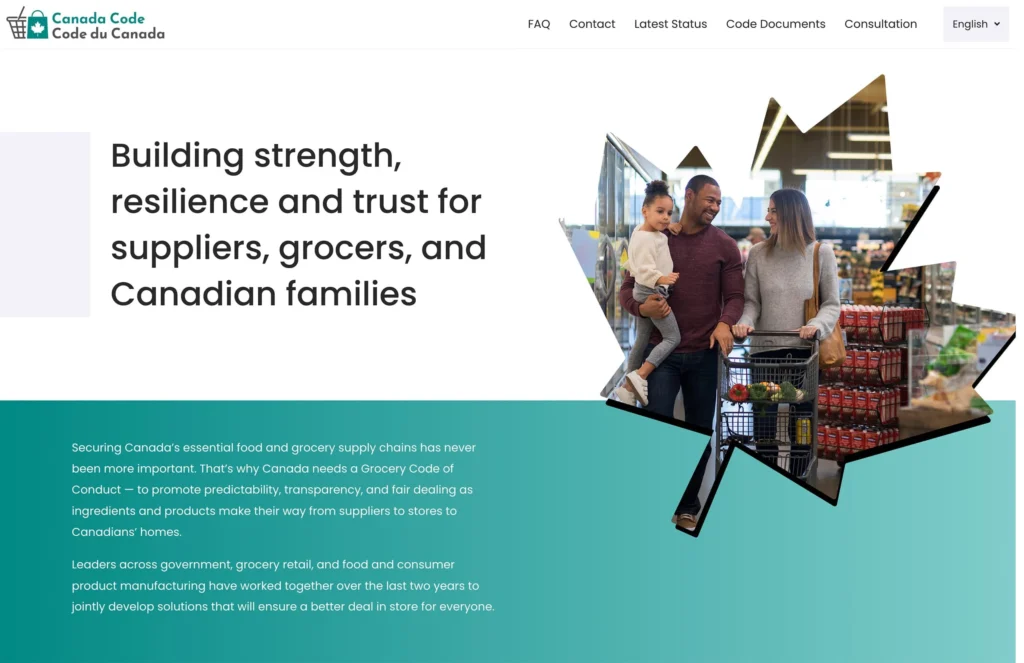
However, the organization’s initial website and visual presentation leaned heavily toward a consumer-facing tone, unintentionally suggesting the Code was meant to address grocery pricing or consumer complaints. This created confusion about the organization’s role and risked undermining its authority at a critical moment.
At the same time, the organization was operating under:
- Tight launch timelines
- Significant media attention
- Evolving internal processes typical of a startup organization
The Goal
The goal was not to “refresh” a website – it was to reposition the organization clearly and confidently.
Success meant:
- Clearly communicating that the Code serves industry participants, not consumers
- Presenting the organization as neutral, authoritative, and factual
- Creating a public resource hub that explains the Code, how it works, and how organizations participate
- Designing a foundation flexible enough to evolve as the organization matured
Just as importantly, everything needed to be delivered on an accelerated timeline without sacrificing clarity or quality.
The Approach
Collaborative Discovery (Without Slowing Things Down)
- Worked closely with a small internal team
- Built on prior discussions rather than duplicating discovery
- Focused on clarity, language, and tone grounded directly in the Code itself
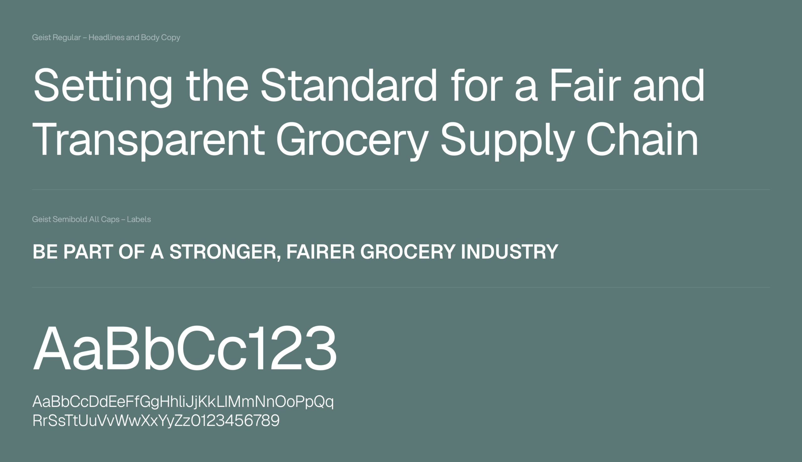
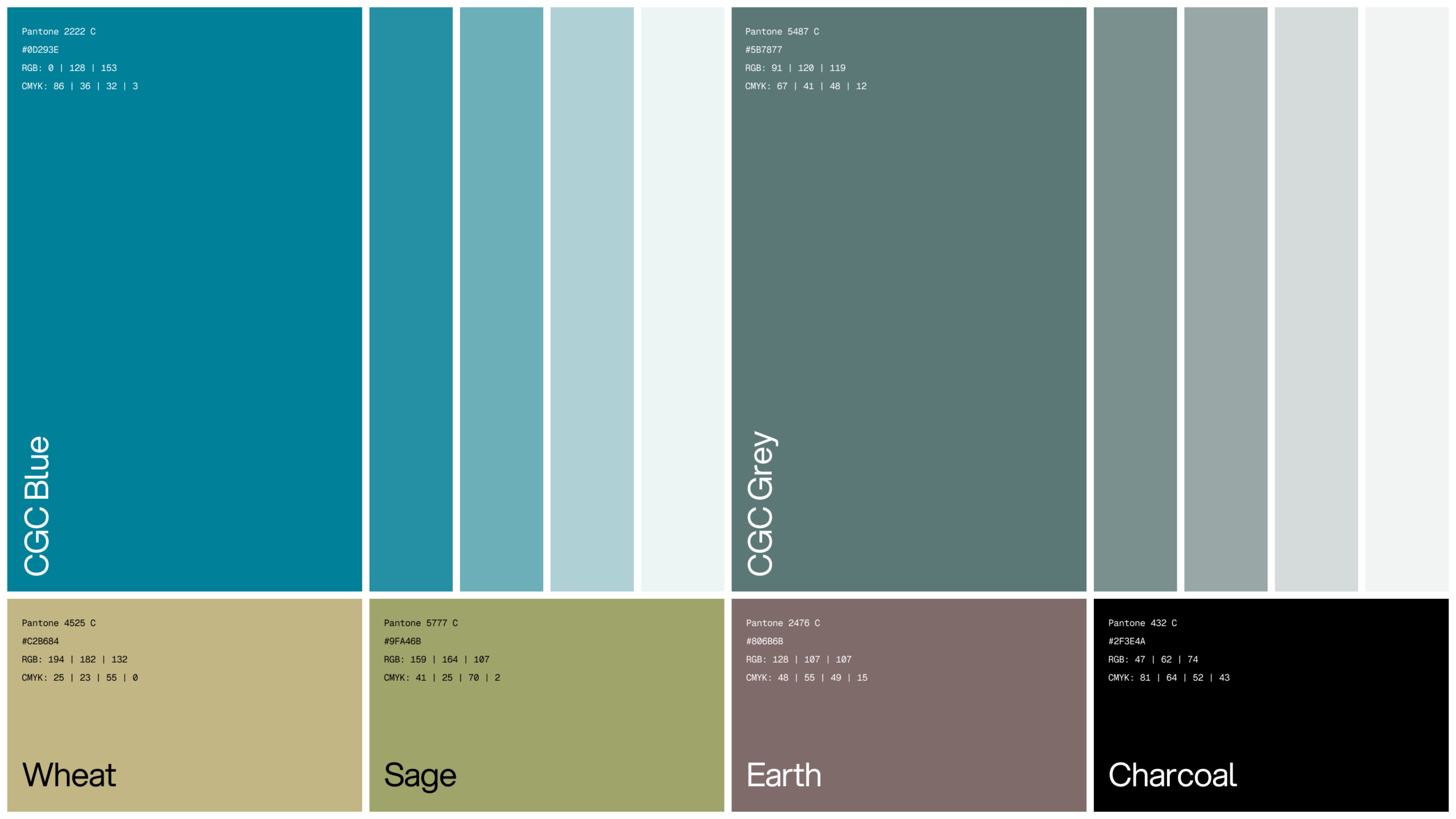
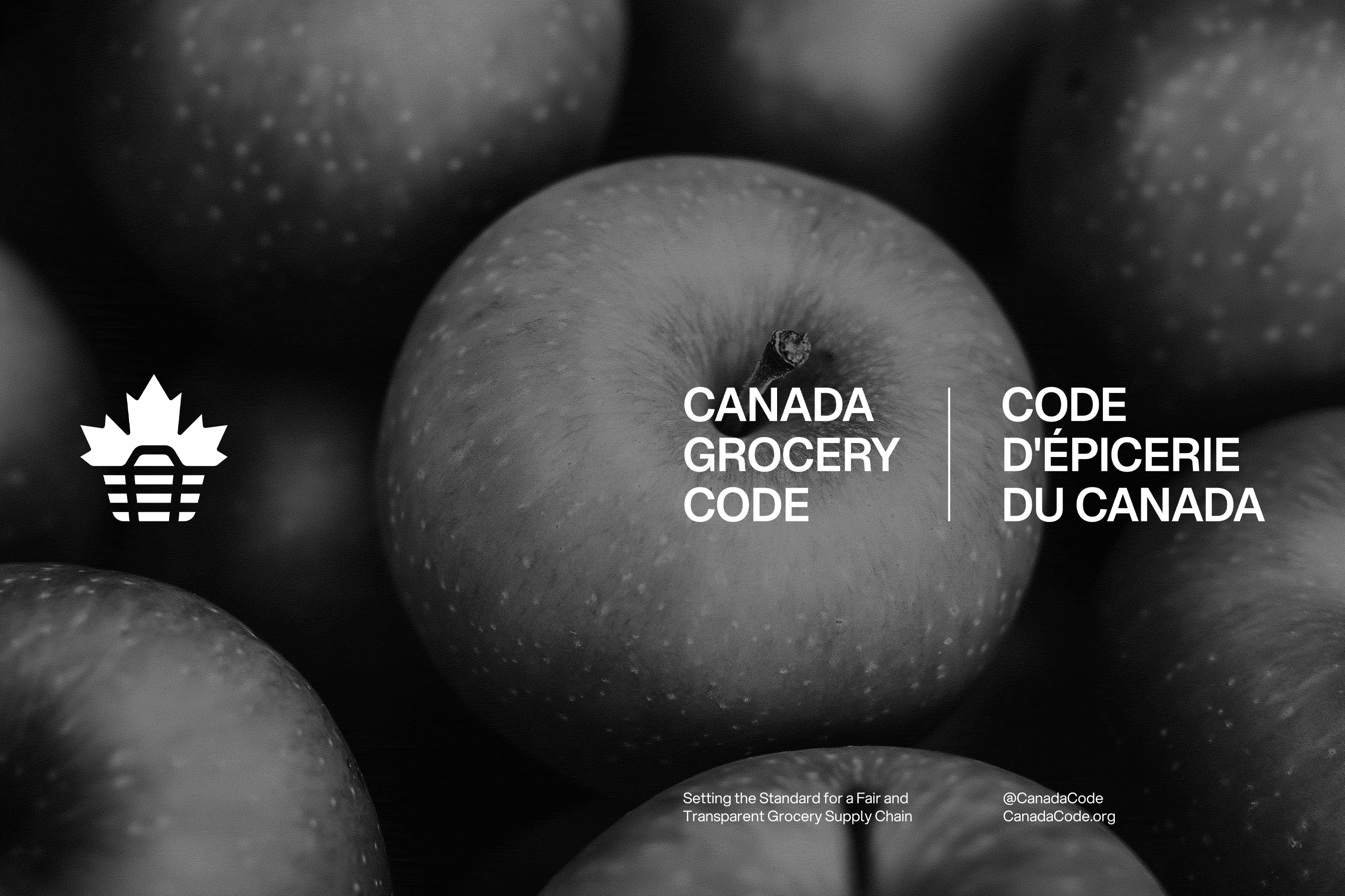
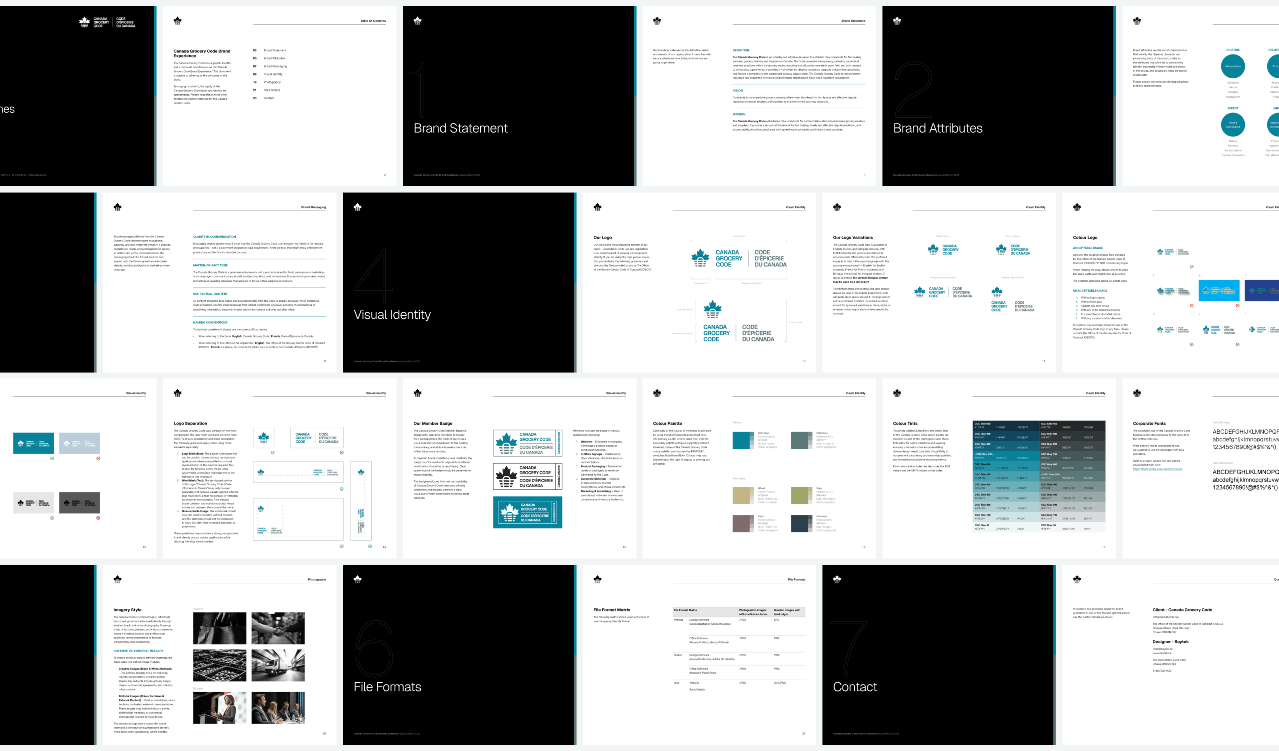
Designing for Authority, Not Attention
- Shifted visual language away from consumer imagery
- Emphasized restraint, hierarchy, and legibility
- Designed to feel closer to a government or regulatory body — without feeling cold
Designing in Parallel with Build
- Public website designed alongside a forthcoming member portal
- Ensured visual and structural consistency across systems
- Planned for future integrations from day one

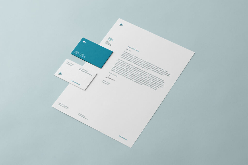
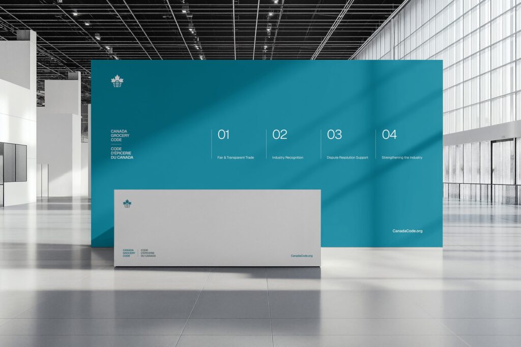
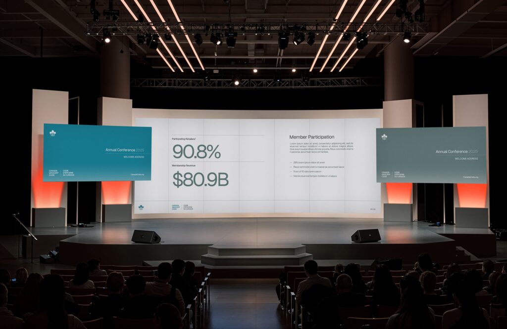
Brand Work Across Touchpoints
The Outcome
The redesigned brand and website gave the Canada Grocery Code a digital presence that aligned with its mandate.
The new site:
- Anticipates stakeholder questions and reduces confusion
- Serves as a central hub for resources, documentation, and engagement
- Supports credibility with industry, media, and government audiences
Since launch:
- Membership has grown to over 150 organizations
- The site averages 13,000 monthly active users, despite being less than a year old
- Strong direct and organic traffic reflects clarity and discoverability
“The new website has become one of our most essential resources — designed to anticipate and answer questions before they even arise.”
Aileigh Karson
Manager of Communications & Stakeholder Relations, Office of the Grocery Sector Code of Conduct (OGSCC)
More Design Case Studies


Connect
Ready to explore your next design project?
Every project starts the same way: with conversation. Lets take time to understand your challenges, your organization, and what success really looks like. Just honest dialogue about whether we’re the right fit.
Prefer email? hello@baytek.ca
Or call us at 613.759.4423