This article explores the framework we use internally to determine whether a design is working or not. In turn, it can be used by our own clients to objectively decide whether a design will achieve their goals.
And by “design”, I really mean anything that we produce – it could be a visual identity, a website or any print piece. These are universal rules that can apply to anything. We find them suuuper helpful to put all that subjectivity out the window, and make sure we’re achieving what we set out to do.
But what is good design? Surely it’s more than a feeling?
Yes – or at least we know what is contributing to that feeling. So without further ado, here’s our criteria for design success, and the questions you should be asking yourself:
1. Balance
Is there alignment? A clear grid? Space for the elements to breathe?
Visual balance is one of the most important things to get right. But also sometimes the hardest. It’s often a good idea to take a step back from the work – blur your eyes – and try and feel if what you are seeing feels balanced. Now what does that mean? An example – you’re looking at a hero design on a homepage. Is there too much visually going on at the bottom? Does it feel bottom heavy – weighted down by busyness or dark colours? Could it be balanced by increasing something at the top, or taking away from the bottom. This is just an example, but simply taking a step back and zooming out helps ensure the design is feeling balanced overall.
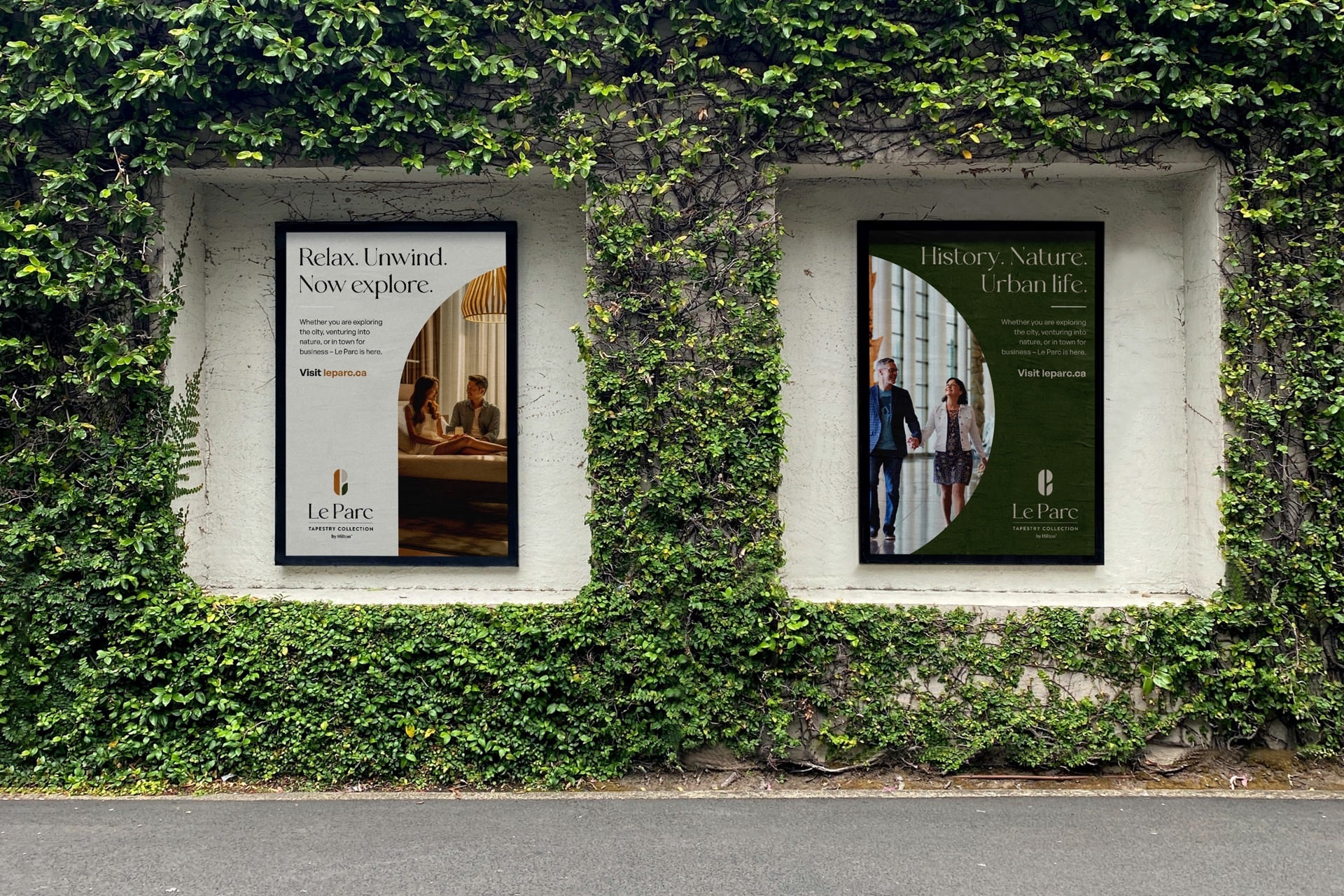
Visual balance is also achieved through alignment. Using an invisible grid to align elements, either vertically or horizontally, allows a natural balance to occur. If things are misaligned, the balance starts to feel off. You’ll know when good alignment has been achieved when you don’t even notice it, because the opposite is true – you will definitely notice it when it hasn’t.
2. Harmony
Is there harmony between the colours? The shapes? The angles? The typographic choices?
The process of determining colour harmony is essentially knowing which colours go well together. Sounds simple enough, right? Certain combinations of colours will tend to almost vibrate visually when used with each other so be on the look out for this – you’ll know when you see it, as it will hurt to look at. Then there are certain colour combinations that you might want to avoid due to certain connotations (red and green = holidays etc.). Even when colours are in harmony, you can still use colour to elevate the level of importance of an element (a bright colour against a dark colour background is going to be saying HELLO, I’M OVER HERE, COME LOOK AT ME).
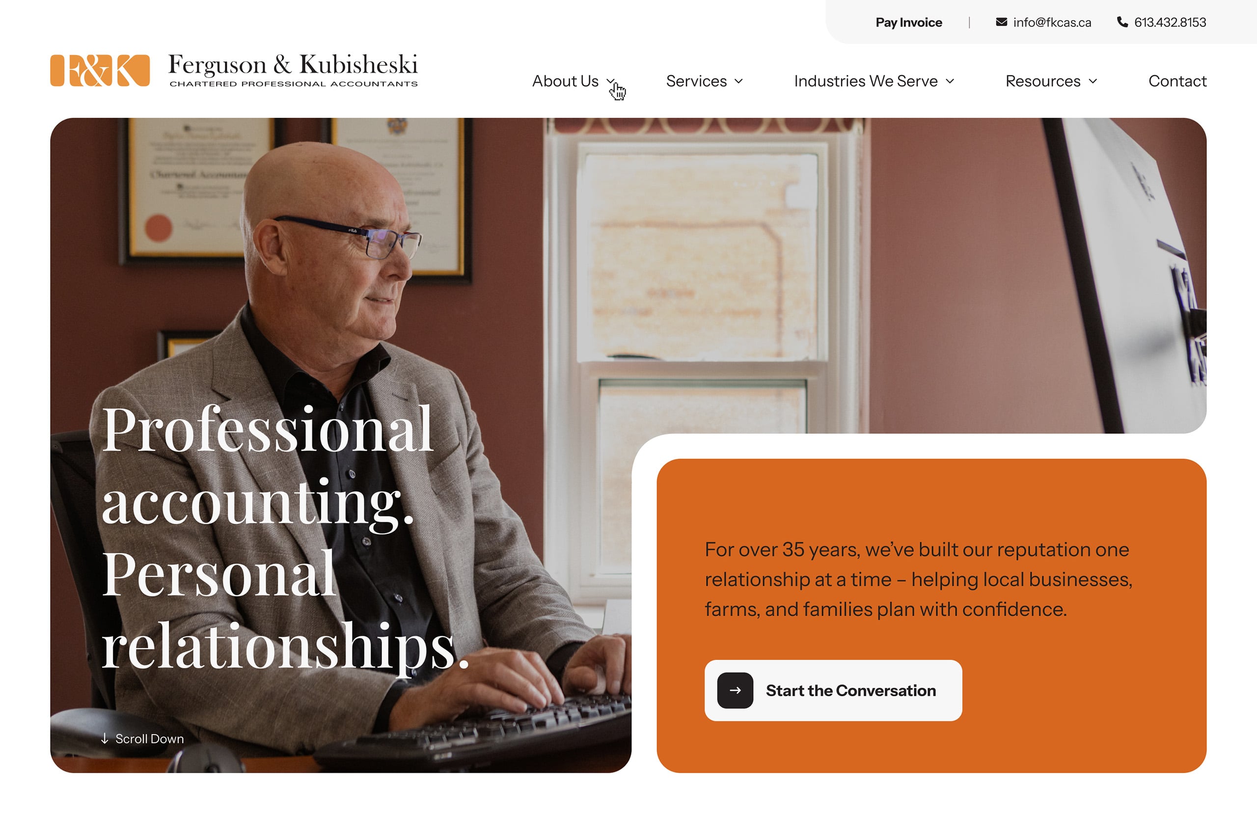
Then there is type (or fonts… or typefaces… or typography – honestly, there’s probably another handbook in there about the nuances for these labels, but we don’t have time for that right now). Typographic harmony is not only about choosing fonts that go well together, but choosing fonts that make sense for the subject matter. There needs to be harmony with the content, the words. Is there a historical or educational context to the subject matter – then maybe a serif font makes sense? Is the brand a sports organization – then maybe a bold, italicized sans serif makes sense? If we go against these norms, then it will be harder for harmony to occur.
3. Empathy
Has the target audience been considered? Is it addressing their challenges, wants and needs? Does it meet accessibility standards?
While not strictly an obvious visual trait to have, the work should strongly consider the people we are designing for. It should seem as if we have put ourselves in the target audience’s shoes and really had a think about what would get them over their challenges and see the real benefit of whatever the organization has to offer them. Remember, we are not designing for ourselves, so we really need to feel what the audience is feeling to be able to design something meaningful for them.
Another important consideration is meeting the accessibility needs of the target audience. I would highly recommend reading this resource from the RGD about creating accessible graphic design. At Baytek, we always design with accessibility in mind even if it might not be high on the list of requirements from a client. There are two general things to keep in mind: colour contrast and font size.
Colour Contrast
There are set guidelines (such as the WCAG) that require a certain colour contrast (text size dependent) in order for a design to pass a certain accessibility level (with AA representing the standard target for most organizations and AAA being the highest, most stringent level). At Baytek, we strive for AA at a minimum. The following ratios define the contrast between the text colour and the background upon which it lives.
- Large Text (defined as at least 18pt (typically 24px) or 14pt (typically 18.66px) and bold)
- AA = 3:1
- AAA = 4.5:1
- Small Text
- AA = 4.5:1
- AAA = 7:1
There are many free online tools and plugins to check these colour contrast ratios. You whack in your two hex values and it will let you know the contrast ratio, and whether it’s passed or not.
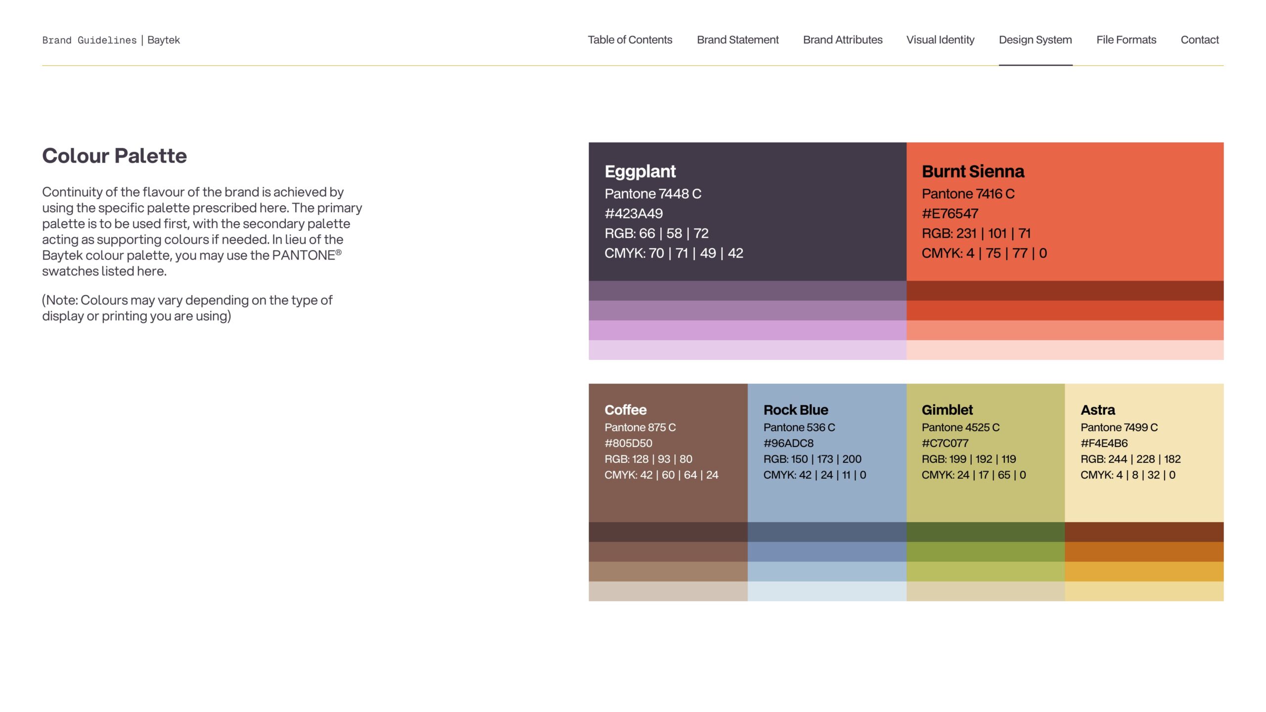
But what happens if the brand colours don’t pass on a white background? Firstly, get angry at the visual identity designer if there isn’t at least ONE colour to use on white. Secondly, if the brand allows (sometimes this is even provided in the guidelines), a shade of the colour could be used.
Colour contrast does also apply to other things outside of text, such as the stroke around an input field or dropdown box. For that, you would apply the following ratios:
- AA = 3:1
- AAA = 4.5:1
Font size
WCAG does not mandate a specific minimum font size, but it requires that text be resizable up to 200% without loss of content or functionality. For accessibility, a base body font size of at least 16px (or 12pt) is recommended to ensure readability.
4. Hierarchy
Is it clear where the viewer’s attention should start? And move to next? And end?
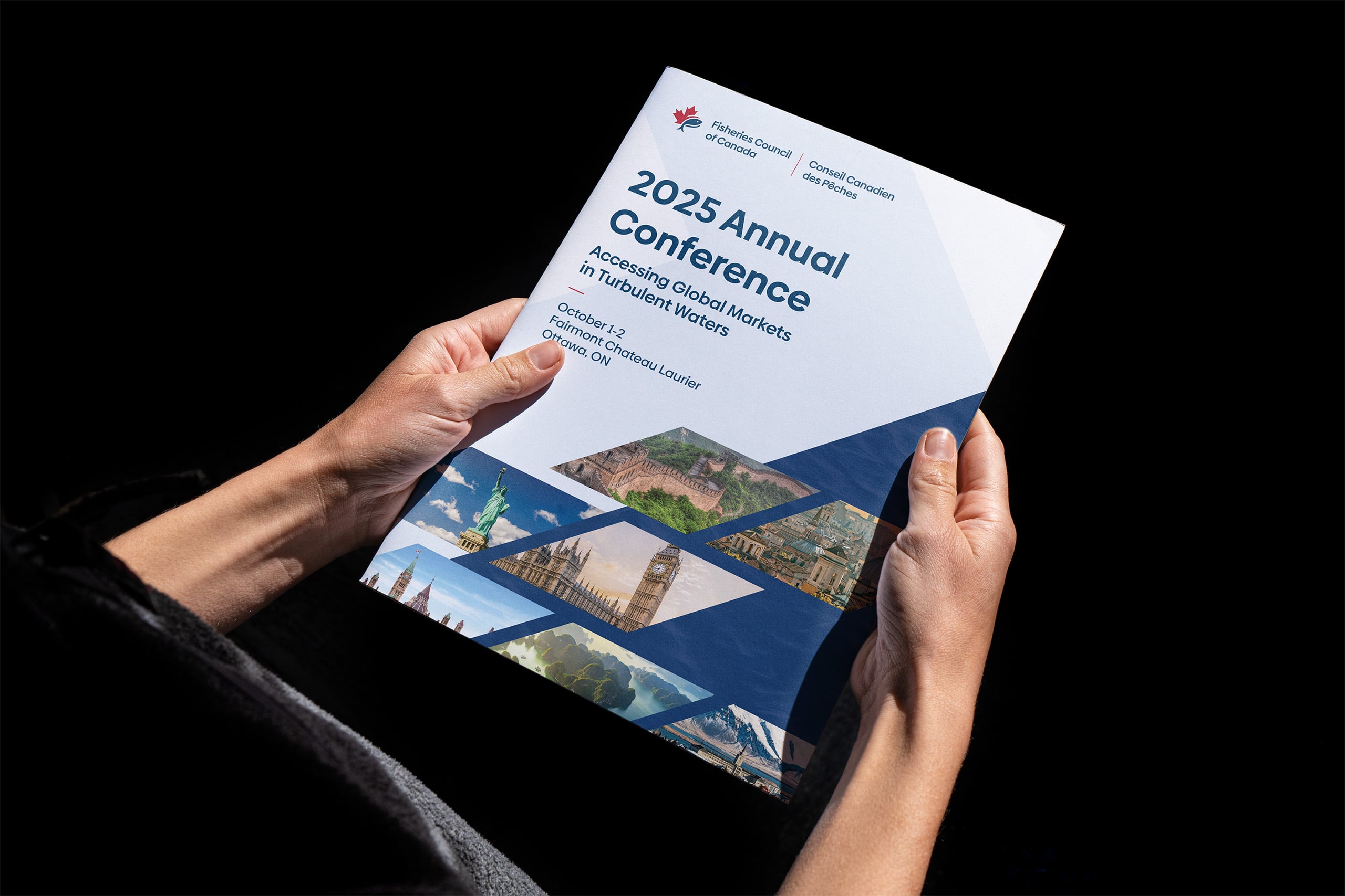
In any design, there should be a level of importance applied to the elements. If everything were on the same level, it would be left up to the user for where their eyes should go. They’ll get confused and disoriented. And that’s the last thing you want. No. No. No. Noooooo. There are a number of ways to imply hierarchy – size, spacing, colour and opacity are probably the top four. We use them to show what is MOST important for the user to look at first, and then go down the list of importance.
5. Differentiation
Does it look different enough from the competition? Will it cut through? Does it elevate?
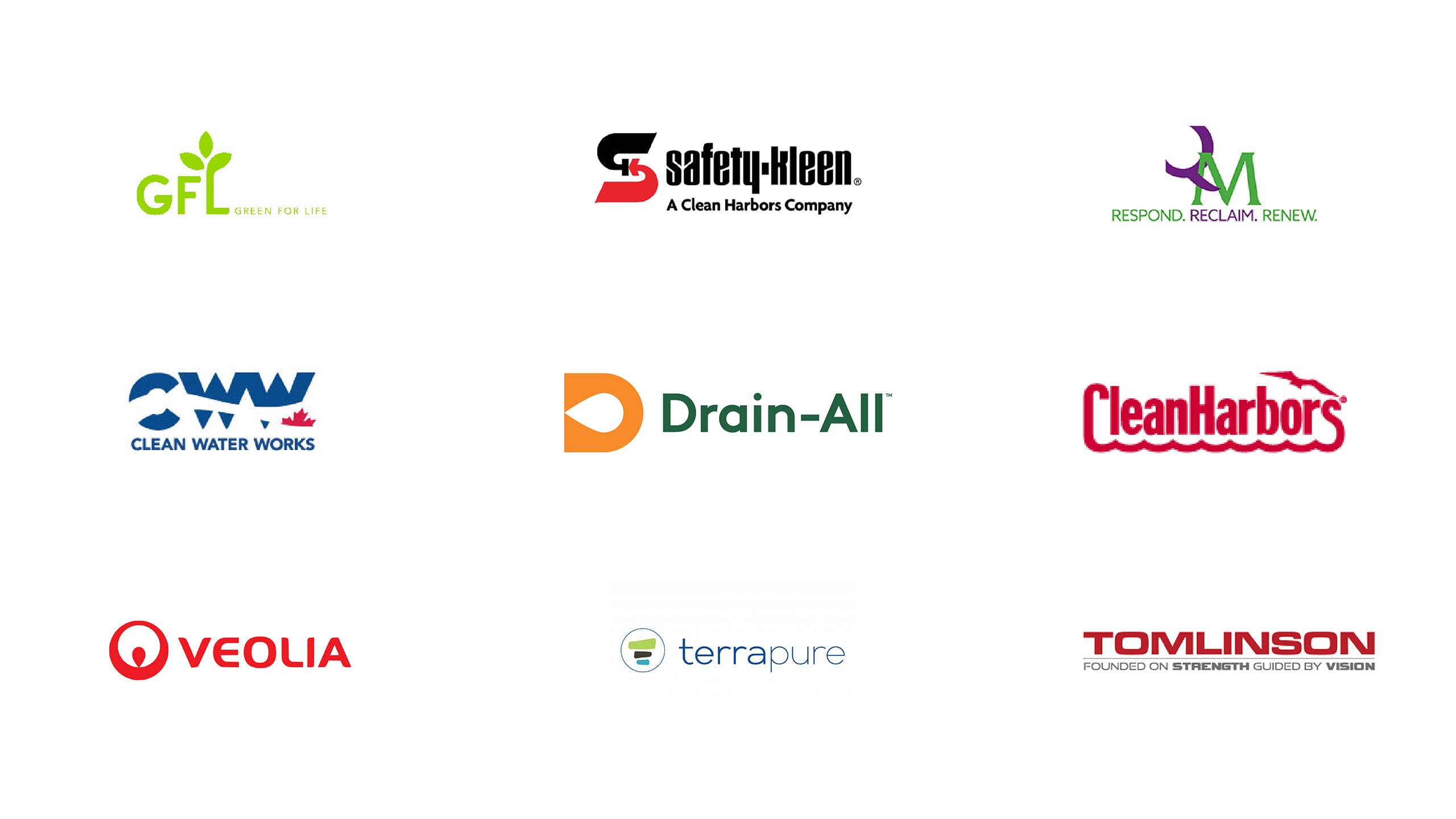
One of our jobs in the early research phase is to get a good idea of who the organization is competing against. This way we know The Bar®. Yes, The Bar® – the absolute minimum we compare our designs against. The research also ensures anything we come up with (be it visuals or messaging) isn’t veering into their lane. We don’t want confusion, we want differentiation (yes, I repeated the heading).
6. On-Brand
Does it align with the brand? Does it look, sound and feel like the organization? Does it represent the brand attributes?
Aaaaand lastly, and maybe most importantly, any design we do needs to adhere to the organization’s brand. It may be all well and good to achieve all the criteria above, but if it doesn’t look or sound like THEM, then we’ve missed the mark.
So when we start a new design, it’s important for us to ask if there is a set of brand guidelines. At minimum these may give details about the logo and the corporate colours, and at best they will give us messaging guidelines and a photo bank to work with. If the organization doesn’t have anything and we’re not in charge of a rebrand, then there’s a lot more work to do in the Discovery Phase. So hopefully the Client Strategist has asked all the right questions, and can provide some brand attributes that we can work with. They will give us a good set of traits that we can translate into messaging and visuals.
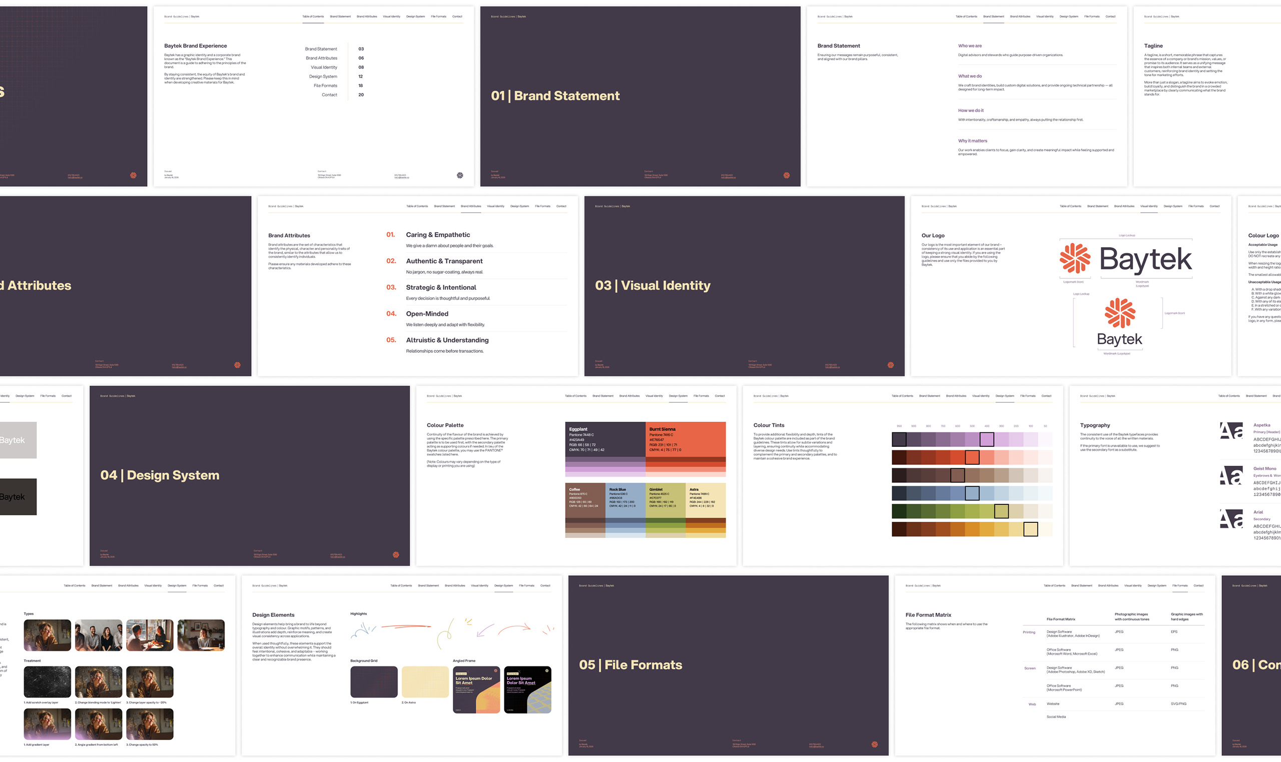
The organization will have a good idea whether the work fits their brand or not, so it’s in our interest to understand the brand as much as possible. The last thing we want to do is present a design that we think is the best thing since sliced sourdough bread, but the organization can not see themselves in it at all. That doesn’t make anyone happy. So we do our homework, and ensure we understand what it should look and sound like. Then, and only then, the magic happens.