This is a behind-the-scenes look at how the new Baytek brand came together. But really, it’s a story of what happens when an agency flips the script and has to do what it’s done for countless clients – discover the “why”. We’ll get into all the nitty-gritty details – so strap in, and come along for the ride.
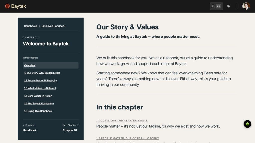
It all began with a handbook
The genesis of the rebrand started back in Summer 2025. While on “vacation” (do business-owners really get vacation??), our Principal Partner, Marlon, attempted to put together a simple onboarding handbook for new employees. But what actually happened was a little different. In order for new employees to understand what makes Baytek, well, Baytek, Marlon had to dig. Dig and dig. On the surface, it would seem obvious – we do good work, and word gets around. But there had to be more to it than that? Why was Baytek approaching its 30th year in business – and still thriving? Why did we have clients that had been with us for 15+ years?
After a lot of thinking (and I mean, A LOT), Marlon came to the realization that it was all about the people. Not the designs. Not the technology. It was how we treat our clients. But they aren’t really our “clients”. They are our partners. And these were not transactional relationships – they were true partnerships. When our partners succeeded, we succeeded.
So while the employee handbook was eventually released – that was only half the work. While everyone at Baytek now understood who we were, we knew we needed to do a better job of showing it externally. There was only one course of action to take (drum roll, please)… rebrand time!
What we had to change
So in order to figure out how to move forward, we had to look in the mirror. What did we look like right now? Well, we looked like a typical agency – we focused on services, projects, and capabilities. But as we established, we knew that wasn’t who we really were.
- We operate as long-term partners
- An extension of our clients’ teams
- Focused on helping them grow, not just completing projects
That difference wasn’t coming through with our existing brand. So, like with every project we’d take on with a client, we needed to start with a discovery session. In fact, we did two. We did one session with the whole team, and another with just the partners. They both yielded some interesting results.
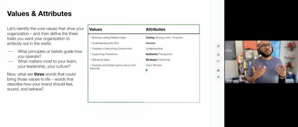
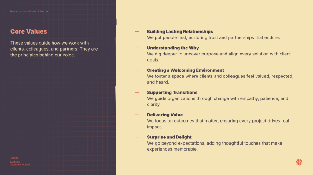
We got to the core values – what Baytek holds true to its heart. We translated those to attributes – words that truly describe how our brand should feel. The look. The tone. We could then take those attributes and let the creative team run with them – everything from the visuals to the messaging. So that was the next step – what would Baytek look and sound like if it leant into these attributes?
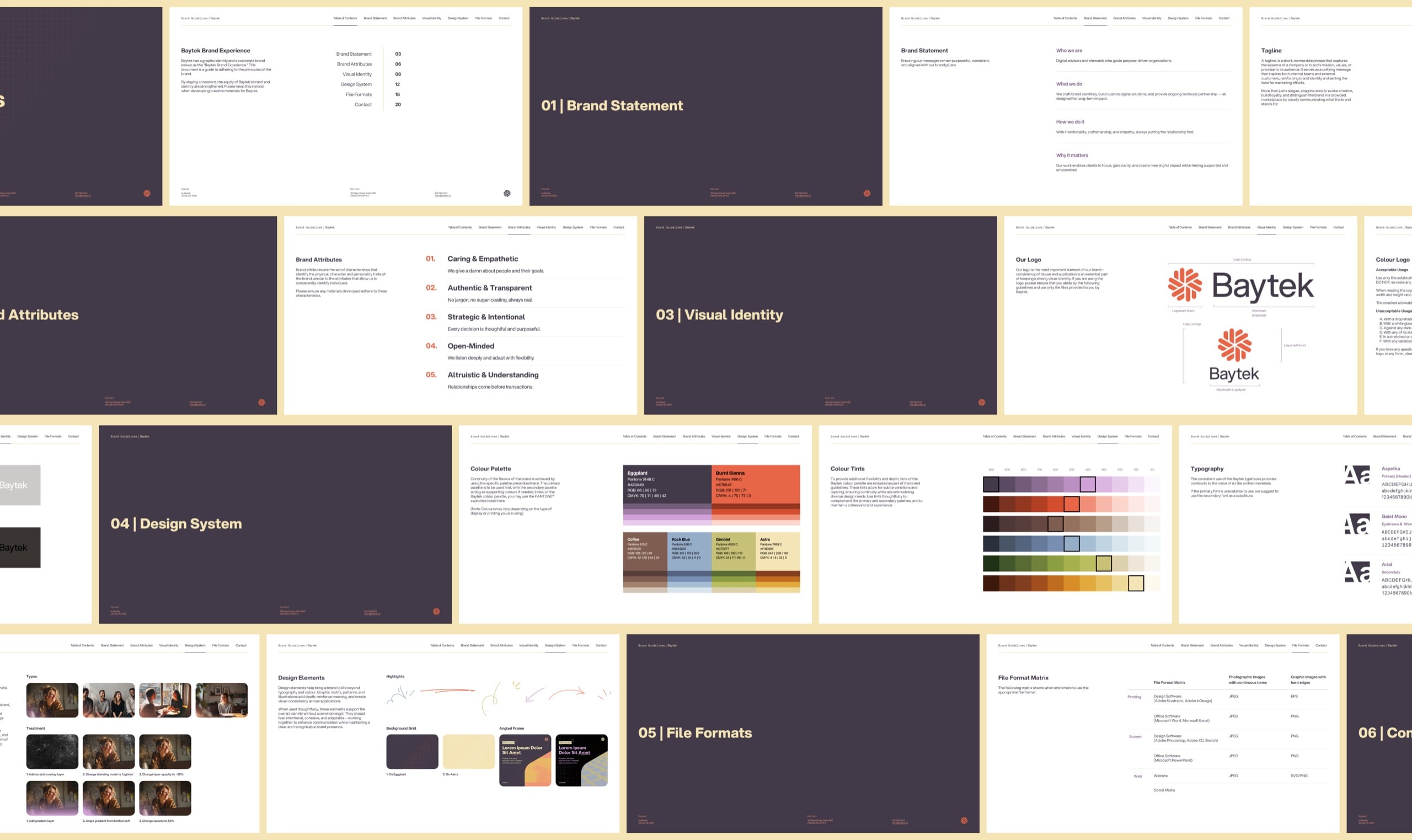
Our strategy team focused on the messaging – and focus they did. In fact, they generated a 34 page document, covering everything from our voice system to our marketing messaging.
But what does “people matter” look like?
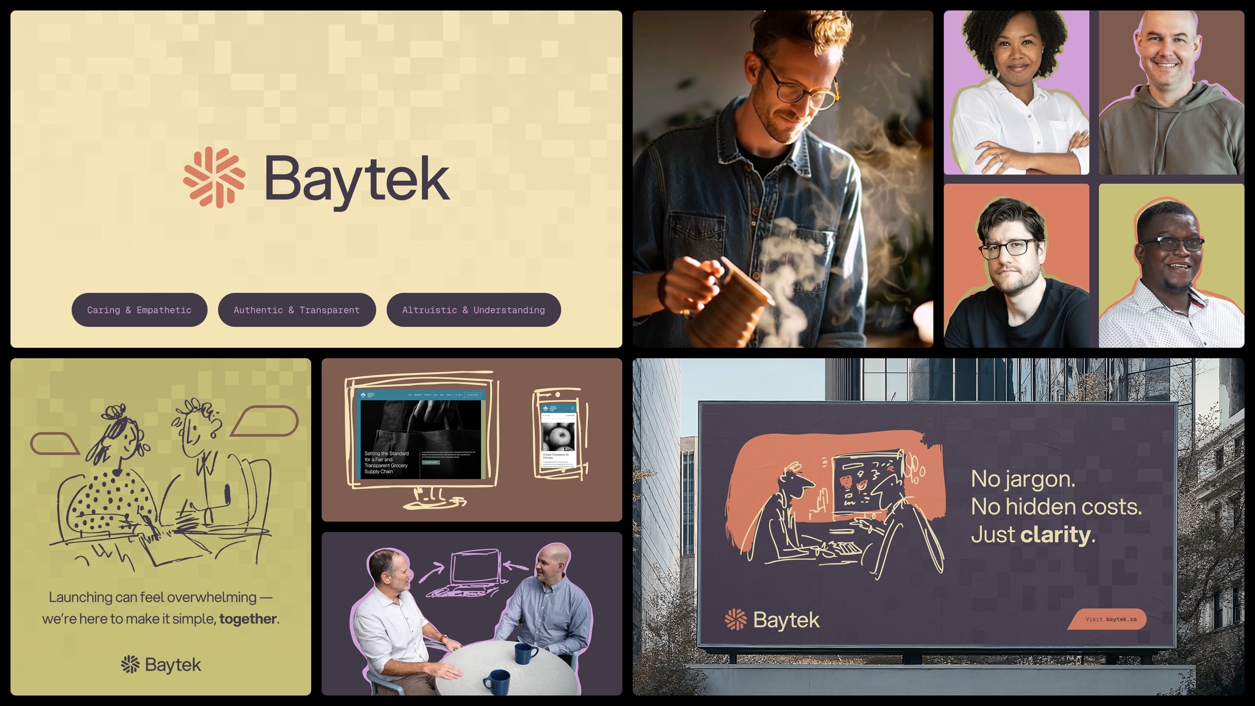
Good question. That was the challenge. We had our attributes, and now it was time to think about putting them onto paper. Well, Figma. We came up with three stylescapes, each leaning more into three of the six chosen attributes.
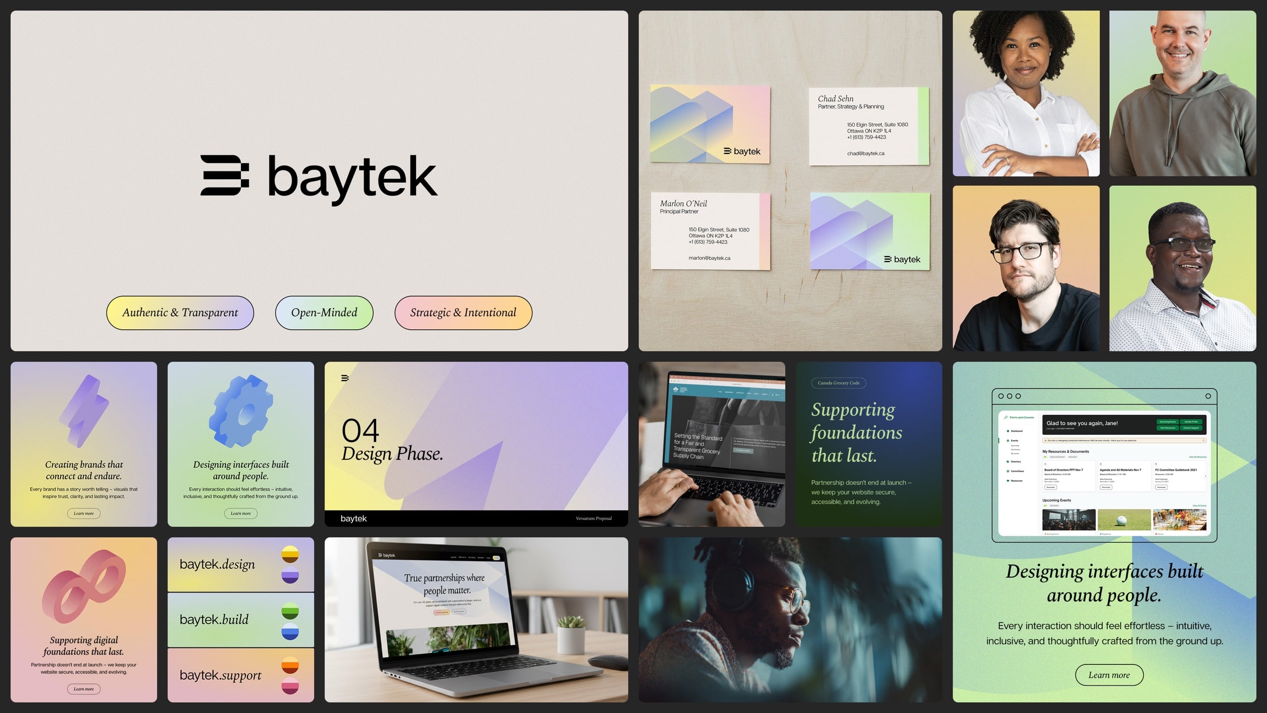
The creative team were really happy with what we came up with. We actually thought it would be a tough decision. Yet, as soon as the leadership team saw the first one – that was it. Rebrands or logos aren’t always love at first sight, but on the rare occasion, it happens. So that was that – we had our creative direction. Now it was time to build it out, and show the rest of the team.
If you can imagine it
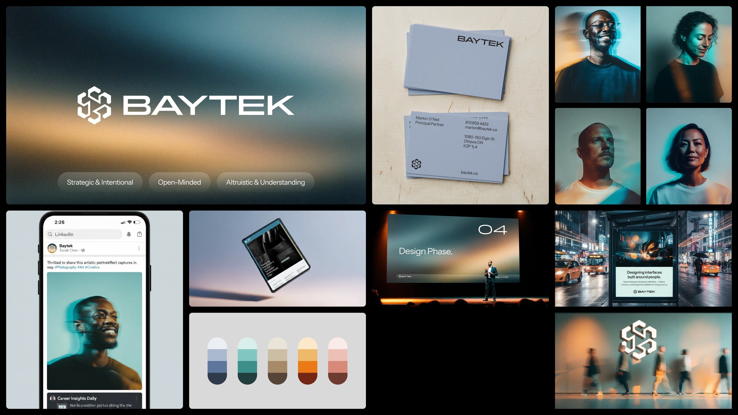
Using the chosen direction, the creative team started to imagine how it could play out across the various touchpoints. We needed to make sure the brand could work in all contexts. So we tested it.
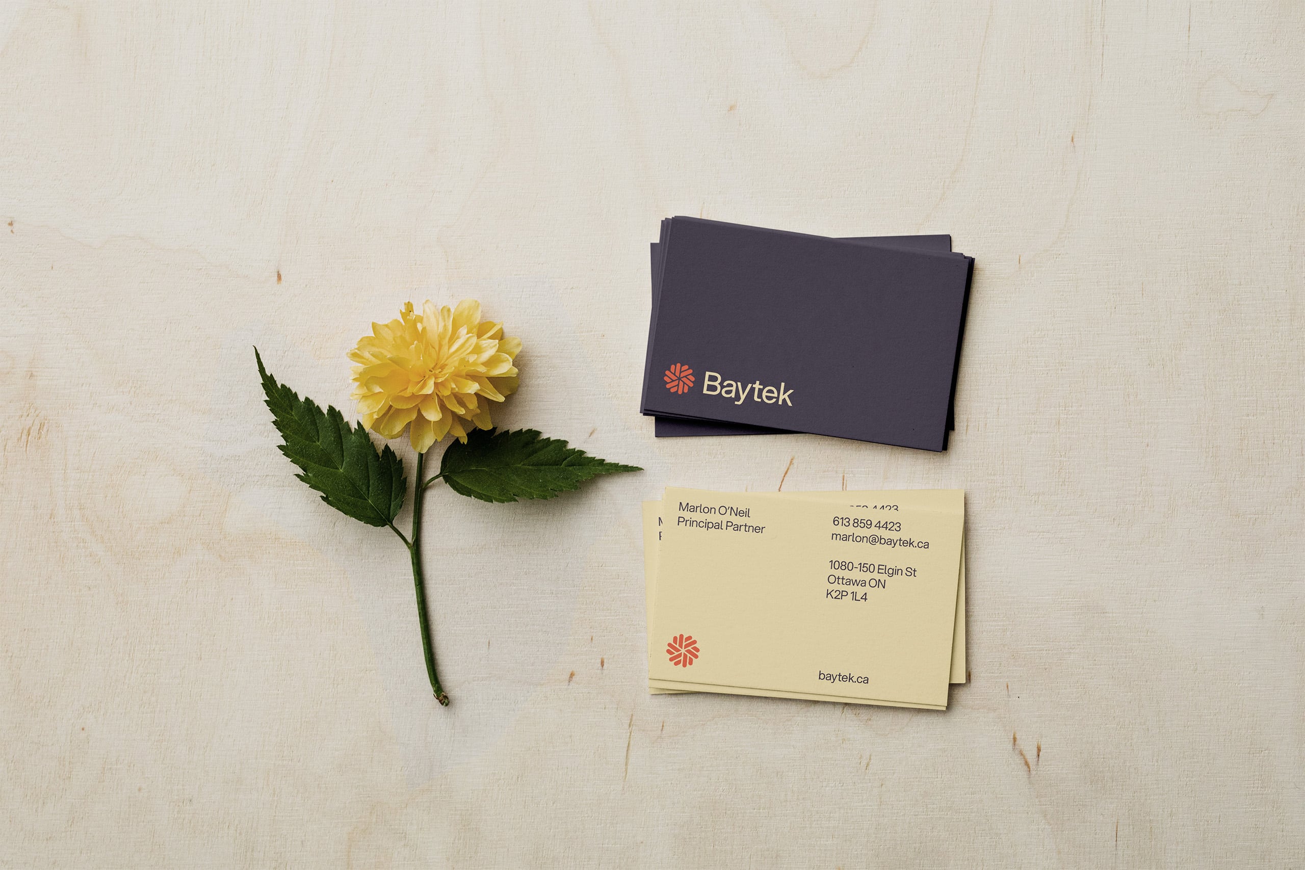
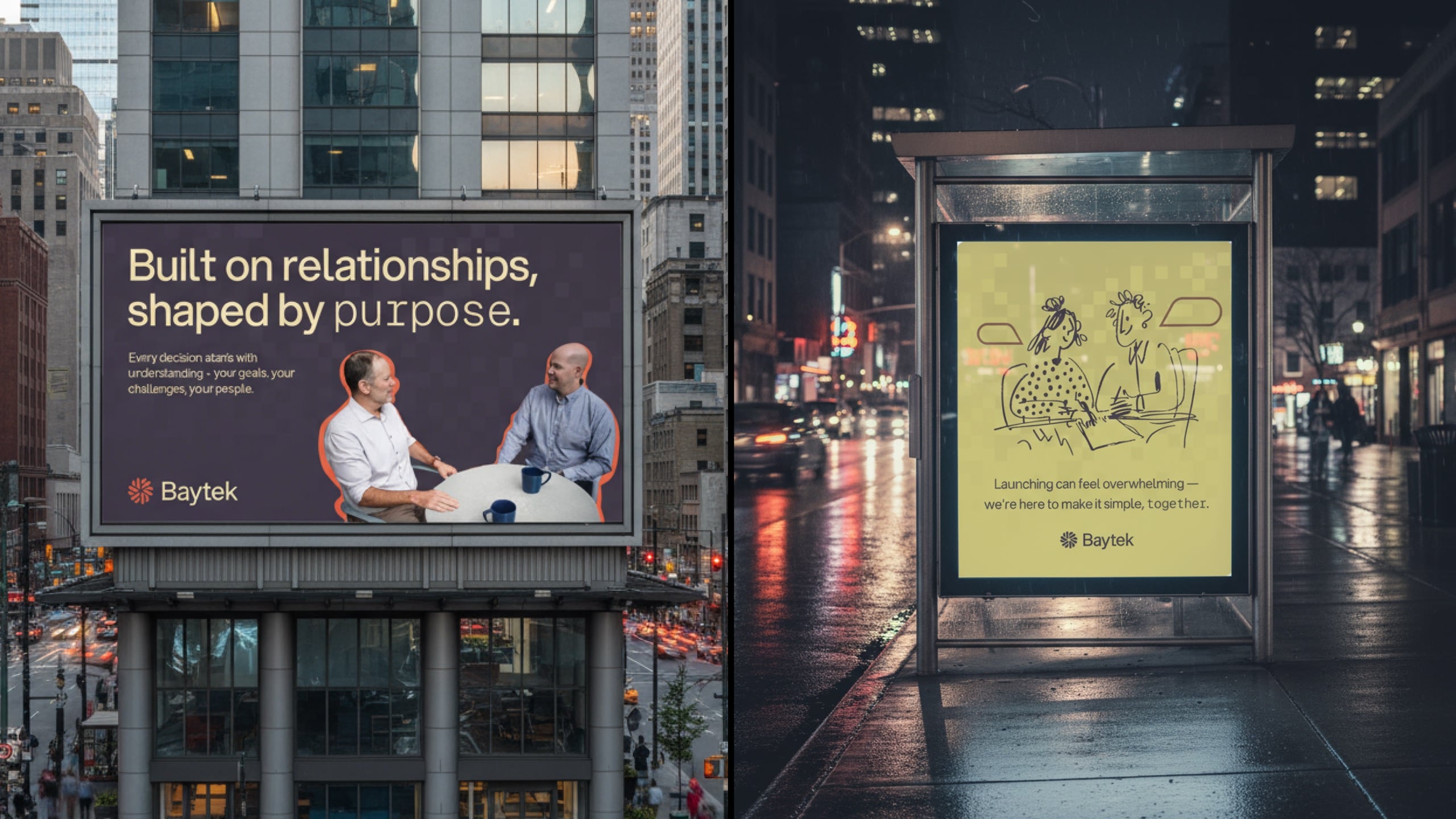
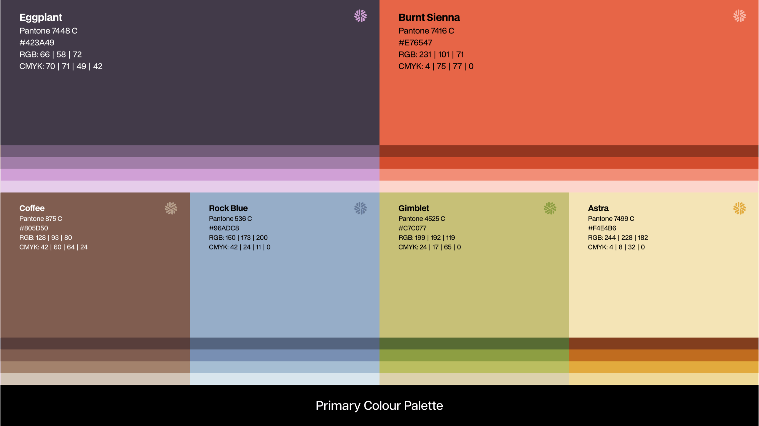
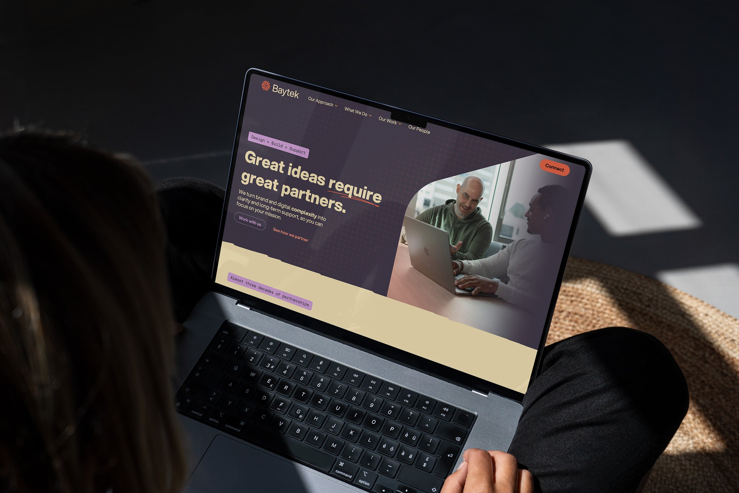
OK – it was holding up. More importantly, it felt right. And the rest of the team loved it. One particular element I do want to highlight is the colour palette. While most agencies tend towards a minimalist, mostly black palette (after all, agencies tend to showcase the work, not themselves, and a zero colour palette helps) – this brand was here to represent partnerships first, not projects. These relationships are warm, and so warm we went.
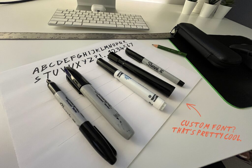
We also knew we wanted to have as many human elements as possible – so we even created our own Sharpie font that we could use to highlight little elements across the website and on presentations.
Not forgetting where we came from and what we do, we also wanted to integrate a digital element. The stylescape initially had this pixelated background, but in practice it started to look like something out of Minecraft. Nothing against Minecraft, we just needed something a little different. In came the “grid”. These background patterns ensured we still had the feeling of a digital focused brand.


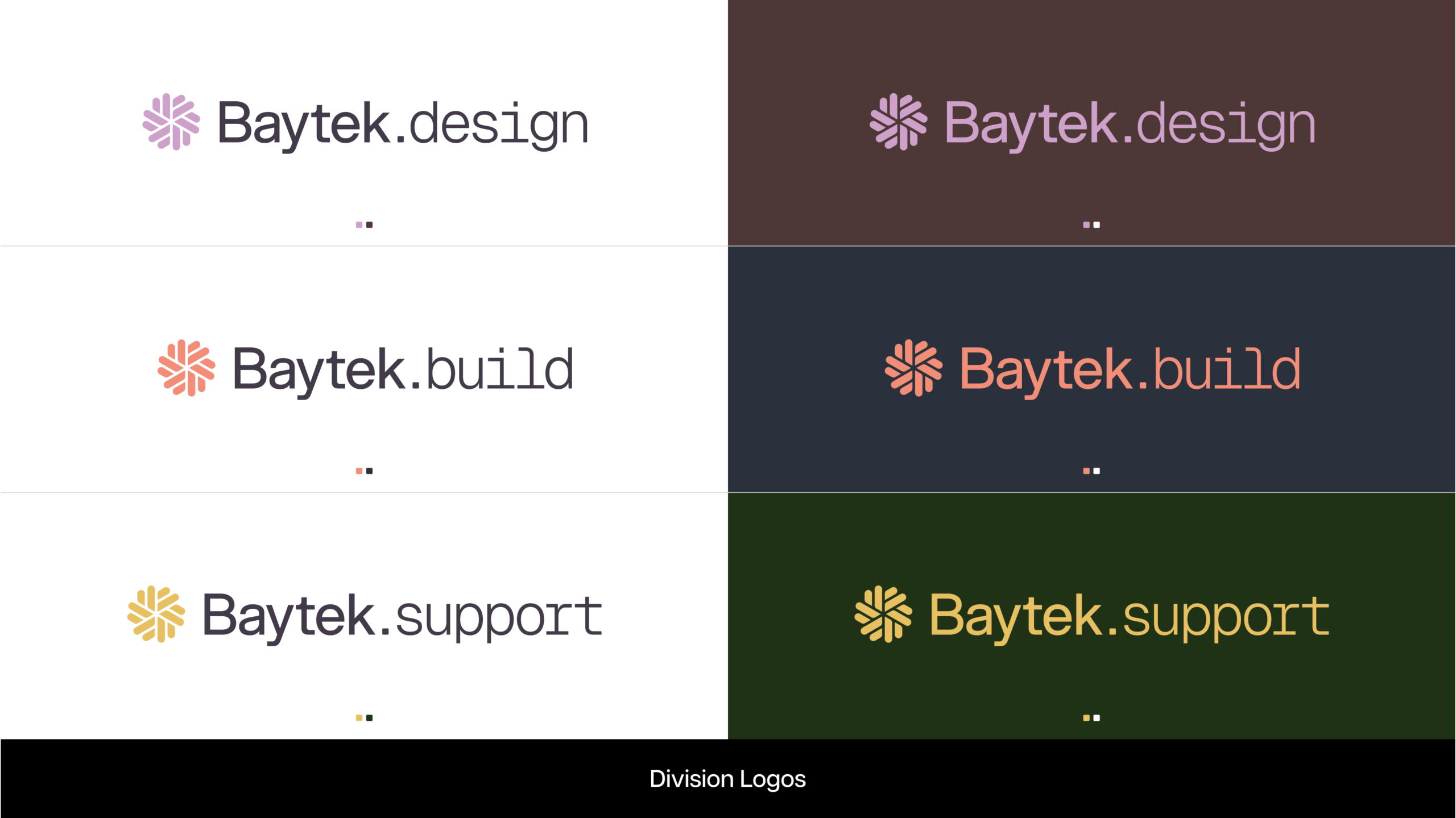
Another important part of the rebrand was to showcase our strengths – design, build and support. These are our specialties, and while we call them divisions – they are more than that.
Each division has developed:
- Deep expertise in their specialized domain
- Unique processes tailored to their type of work
- Service offerings that clients can clearly understand
- Excellence standards that define quality in their field
So we gave each division its own sub-brand logo, and colour combination. You’ll see these in action throughout the website.
OK – we did it! We had our new look and new voice. We packaged it up into a neat brand guidelines document, and then realized the biggest challenge was ahead.
The website and the final stretch
The website was the final piece of the puzzle (I’ve glossed over all the internal document templates, but nobody wants to hear about that!). This was probably the biggest undertaking, as we needed to totally reimagine everything. The content, the photography, even how we showcased our work and our partnerships.
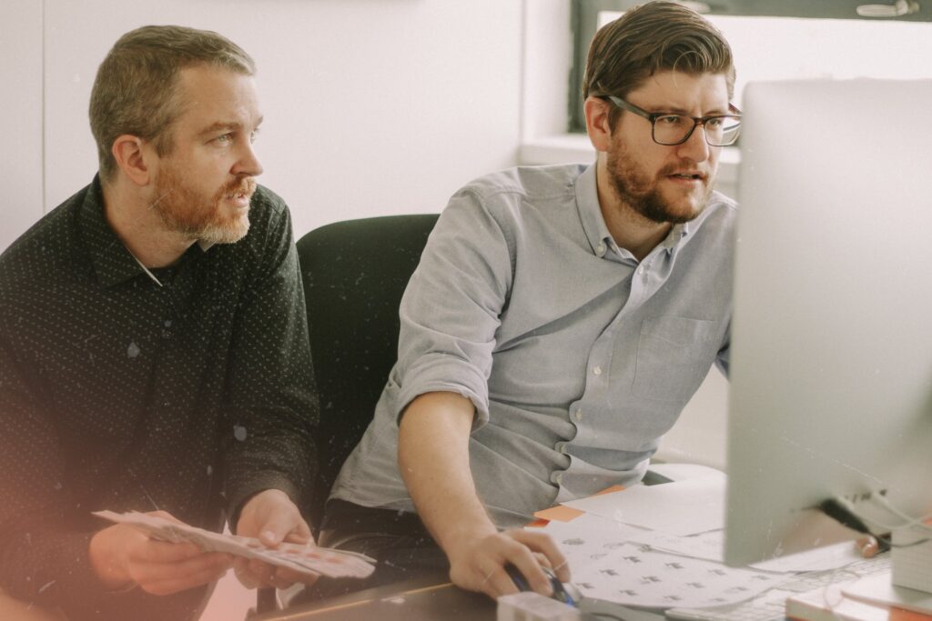
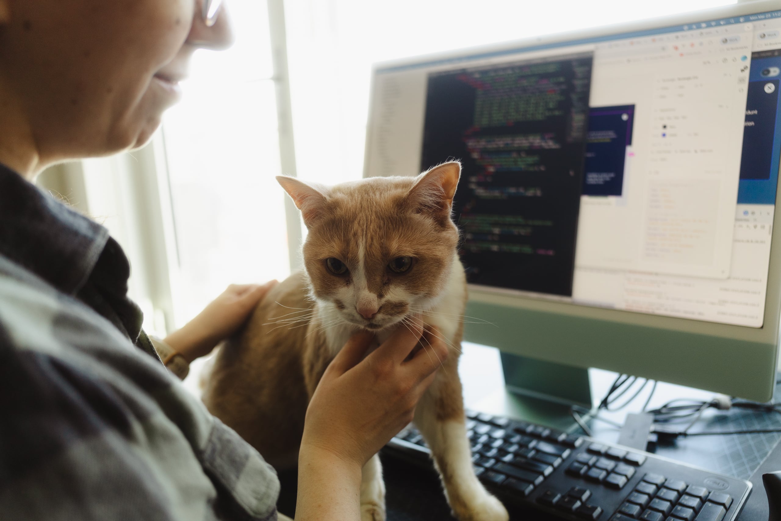
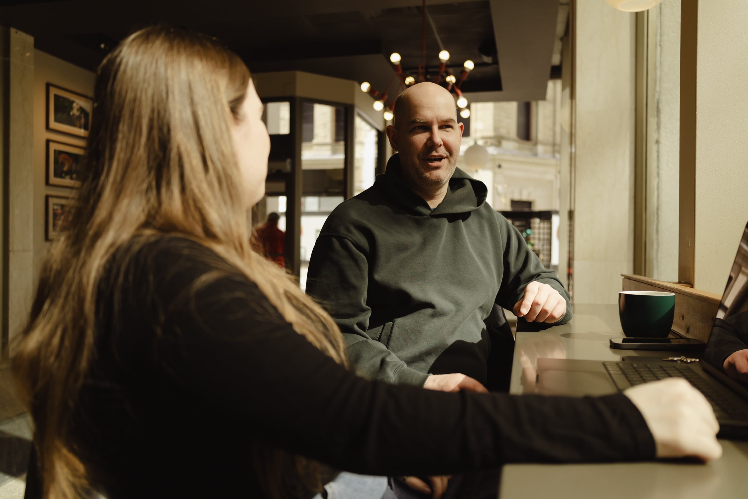
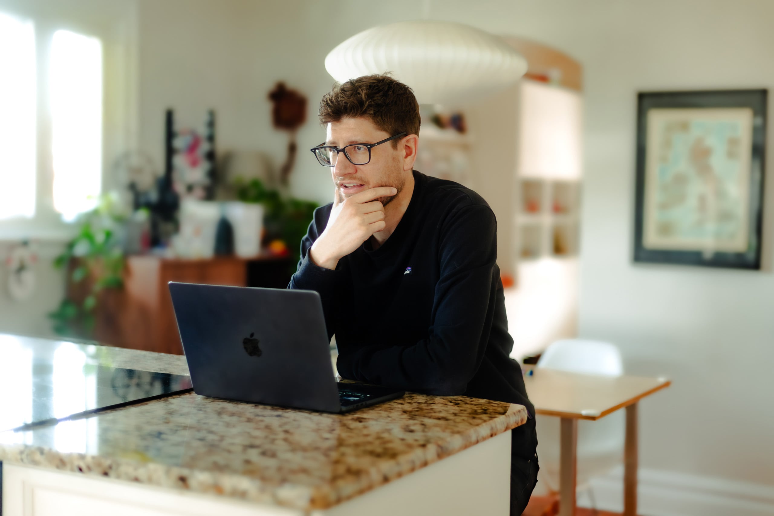
I will save you photos of the blood, sweat and tears (and weeks of tweaks and QA) that went into it, and instead showcase a few that Fran took of us at work (she did a great job). Yup – living rooms, home offices, coffee shops – we kinda work wherever.
In reality, there is still more to come and what you see right now is just the start. We can’t wait to roll more of the brand out and add to the website in the coming months. We’re so excited that our brand now finally represents who we truly are. Don’t be shy – say hi and let us know what you think.