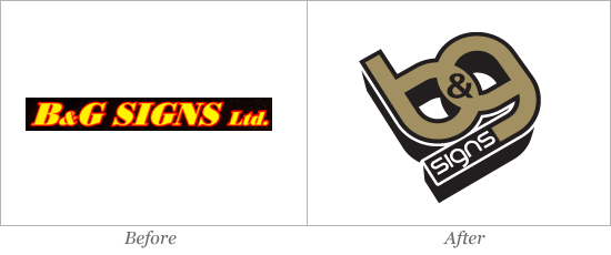
 B&G Signs Ltd. began operations in 1991 in Nepean, Ontario making “computer-cut” vinyl signs. Today B&G are still at the cutting-edge of Ontario’s sign industry, utilising the latest sign-making technology. To carry on the tradition of continuously modernising their company, B&G also needed to echo this sentiment in their brand. Baytek started from the drawing board, with a new colour palette, and a new approach. Using a faux 3D perspective and a solid type-face, Baytek were able to create a timeless mark, that not only represented B&G’s current business model, but its future as well.