Navigate. Connect. Save.
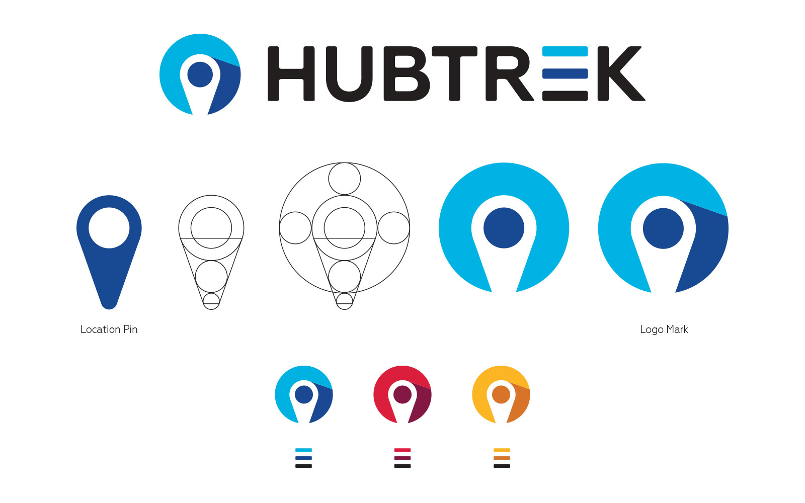
On the surface, it is easy to see the location pin in the negative space. We wanted to create something simple yet iconic, as it will be seen on everything from a smartphone to a giant billboard. We want this icon to be seen everywhere and be instantly recognizable as ‘HubTrek’ – just as the bird is for Twitter or the F is for FaceBook.

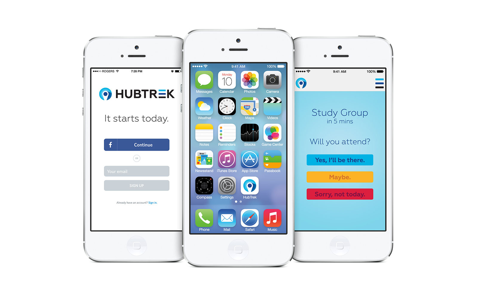
It starts today
The ‘e’ from HubTrek was formed into a mobile/hamburger menu. This is to represent the ‘app’ as well as the multiple options for the end user. There will be uses for this in the app itself, as well as on a website.

