Smiles around the corner
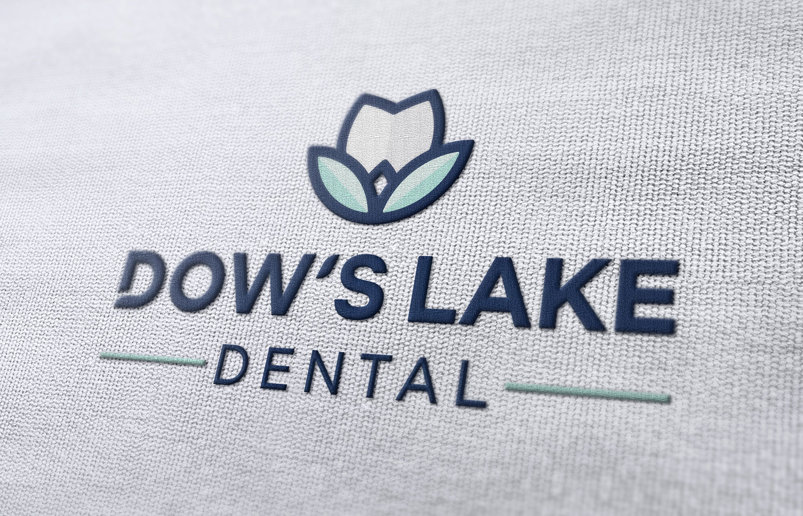
The idea for Dow’s Lake Dental was to produce a brand that spoke to families, students and young professionals alike, but also representing the personality and values of the dental practice. That meant creating a unique logo mark that was fresh, fun and simple, coupled with a modern font that was clinical yet approachable. Dow’s Lake is often associated with tulips because of the annual Tulip Festival which takes place in close vicinity to the lake – and with the dental practice being named after its proximity to the lake, we felt it was a great idea to use this as the basis for the logo.


Energetic. Efficient. Compassionate.
As well as the branding and exterior sign designs, we worked on a one-page website for the new clinic. Using the same fresh and clean approach we used for the branding, we carried on that aesthetic through onto the website. It’s simple, mobile friendly and speaks to all the target audiences!

