Designing a thoughtful, inclusive experience for a sensitive healthcare topic
Lorem ipsum dolor sit amet, consectetur adipiscing elit. Sed massa leo, blandit eu aliquam id, posuere vel orci. Phasellus commodo at purus in ornare. Suspendisse nunc justo, scelerisque sed lobortis eget, gravida a nisi. Phasellus luctus interdum viverra.
Sector
Specialties
What we did
Calmness. Regeneration.
Our ultimate goal was to achieve an abstract shape that had its grounding in something related to deprescribing (a pill). However, we didn’t want the final logo mark to be too literal, because the issue in hand can be a sensitive topic. Anything too obvious could have potential negative connotations. The final shape exudes a sense of calmness and regeneration, and leaves the audience with a positive feeling.

This is for everyone
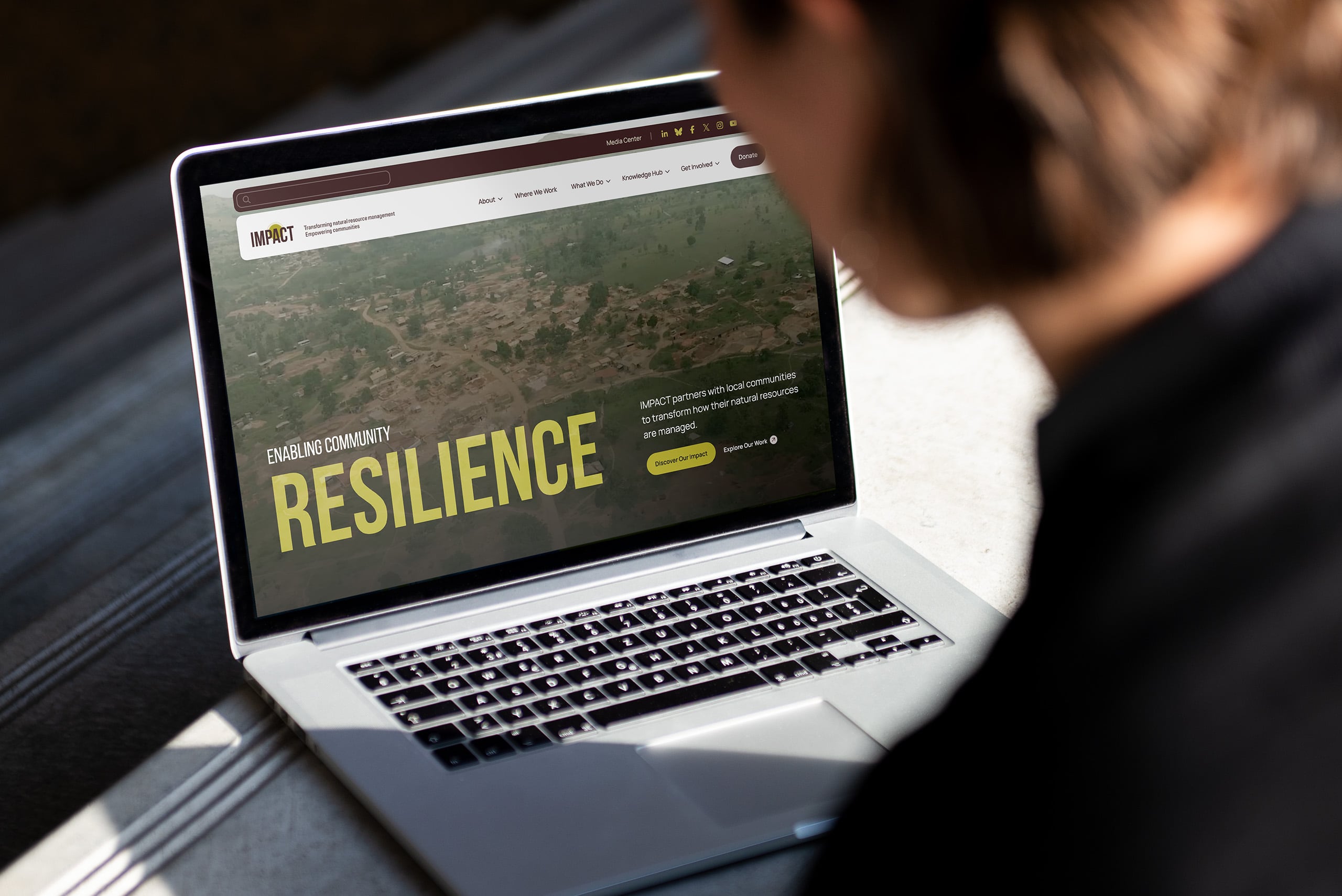
The deprescribing.org project was unique in the respect that it not only did it need to cater to doctors and physicians, but also to the patients themselves. This meant a very careful and deliberate balance was needed for the design of the website – using custom iconography and unique photography treatment, the result is a beautiful, user-friendly website for all ages.


More Design Case Studies


Connect
Ready to explore your next design project?
Every project starts the same way: with conversation. Lets take time to understand your challenges, your organization, and what success really looks like. Just honest dialogue about whether we’re the right fit.
Prefer email? hello@baytek.ca
Or call us at 613.759.4423