Bringing a financial platform to life through a clear and engaging digital experience
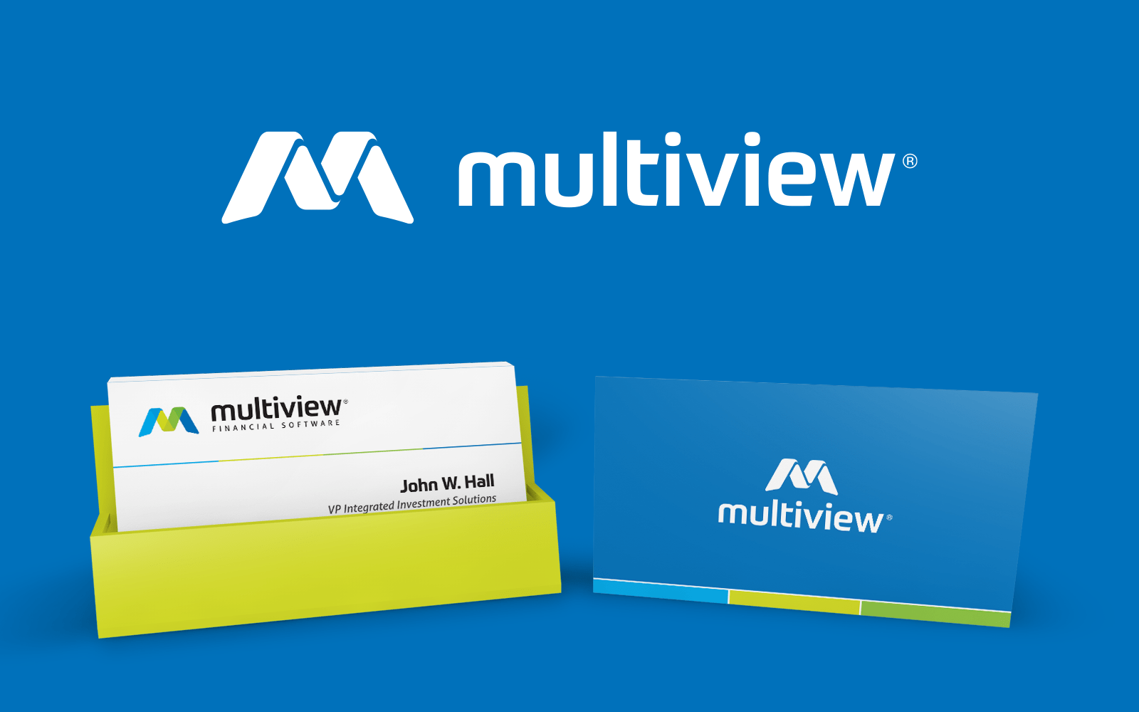
Founded in 1990, Multiview was established to provide financial software solutions to companies all across North America. Multiview clients vary in size and operate in over 40 industries, with many being listed on the major North American stock exchanges. Baytek was hired to rebuild the brand from the ground up, including a revamp of their website and print materials.
Sector
Specialties
What we did
A seamless experience
The logo mark is essentially a letter “M” for Multiview. However, it can also be broken down as a “V” (highlighted in green) for ‘view’, a checkmark (also highlighted in green) and a stylized 3D line chart. The angle of the lower parts of the mark have been created in a way to simulate it being perched on top of a circle/globe – thus, getting the best ‘view’. Using colour we have simulated an opacity effect, which is alluding to the idea of financial transparency but also glass/windows which relates back to the ‘view’.


Fully integrated
The Multiview website expands on the established branding we had developed. Using the colour palette and the iconography we were able to bring the Multiview software to life, giving the user a dynamic and engaging experience throughout.


More Design Case Studies

Connect
Ready to explore your next design project?
Every project starts the same way: with conversation. Lets take time to understand your challenges, your organization, and what success really looks like. Just honest dialogue about whether we’re the right fit.
Prefer email? hello@baytek.ca
Or call us at 613.759.4423